
Is Flat Design Dead Exploring New Trends in UX Graphics
9 min read Discover how UX graphics evolve beyond flat design with fresh trends reshaping user interfaces. (0 Reviews)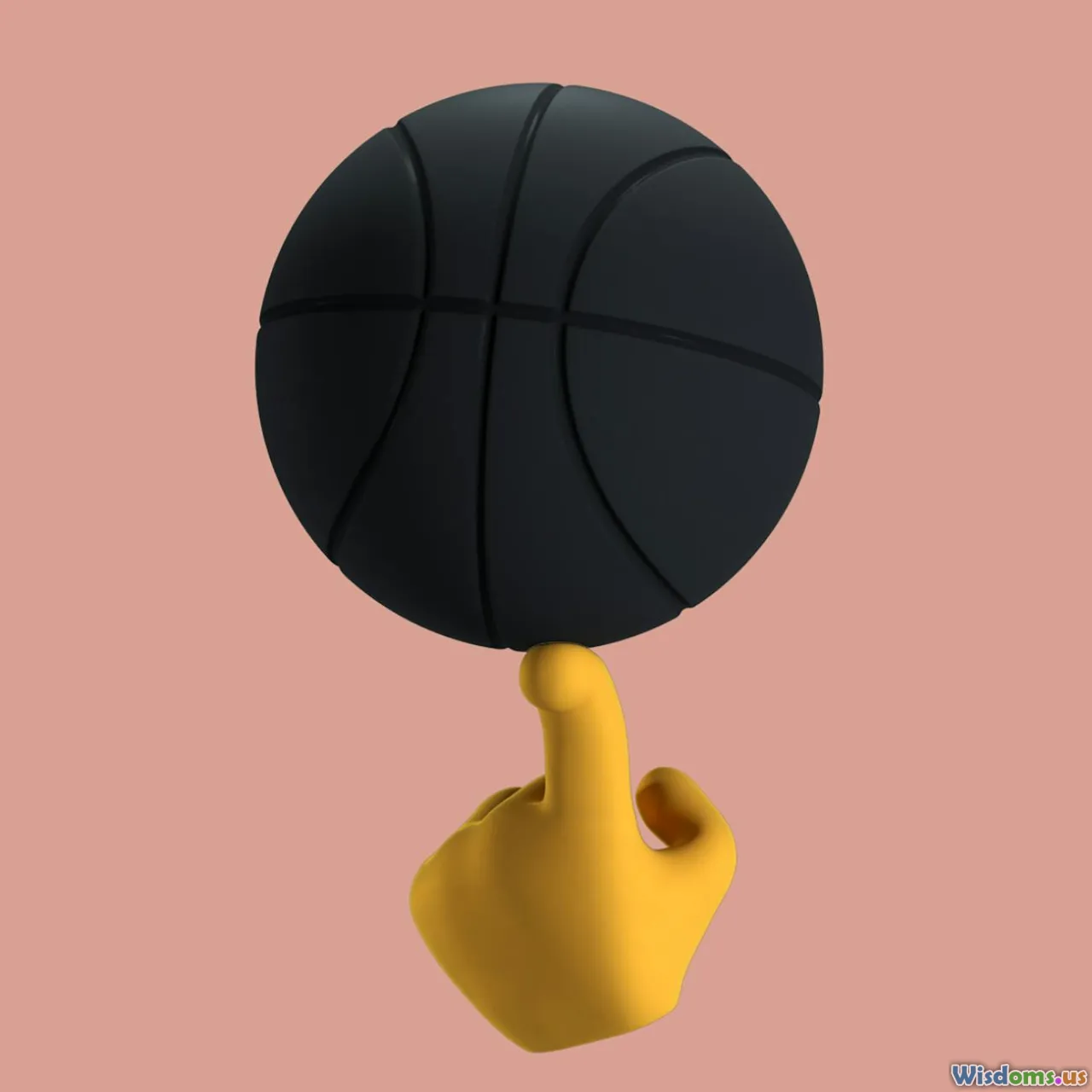
Is Flat Design Dead? Exploring New Trends in UX Graphics
Introduction
For over a decade, flat design has reigned supreme in digital design and user experience (UX), thanks to its minimalist aesthetics and clarity. Its clean lines, crisp colors, and absence of embellishment embodied modernism, making interfaces feel streamlined and accessible. Yet, as the UX landscape continuously evolves, designers and users alike ask: is flat design dead? Or is it simply transforming into something else?
This article dives into the shifting currents of UX graphic trends, examining whether flat design is losing its versatility and appeal. We'll explore how emerging styles such as neumorphism, vibrant gradients, 3D illustrations, and glassmorphism are pushing UX visuals toward richer, more dynamic experiences. Along the way, we will highlight real-world examples, analyze why these trends are gaining momentum, and discuss how designers can effectively use them in tandem with flat principles.
The Rise and Reign of Flat Design
Introduced prominently by Microsoft’s Metro UI in 2010 and popularized strongly by Apple’s iOS 7 redesign in 2013, flat design focused on usability through simplicity. It abandoned skeuomorphism—the design that mimics real-world objects—by removing textures, shadows, and gradients in favor of clean typography and solid colors.
Why did flat design explode?
- Performance: Simplified graphics enable quicker loading times, essential for mobile devices.
- Clarity: Reduced visual noise helps users focus on content.
- Scalability: Flat elements easily adapt across various screen sizes.
Brands like Google fully embraced flat design with Material Design, pushing to unify physical and digital cues while maintaining simplicity. Flat design shaped interfaces across websites, apps, and even print, becoming synonymous with ‘modern’ design.
Signs Flat Design is Evolving, Not Dying
Does that mean flat design is obsolete? Not exactly. Instead, it’s undergoing an evolution. The limitations of pure flatness—such as potential blandness, lack of hierarchy cues, and absence of tactile feedback—have motivated designers to infuse new life into the style.
1. The Birth of Neumorphism: Soft and Tactile
Neumorphism, a portmanteau of "new" and "skeuomorphism," is one of the most talked-about trends derivering from flat design but adding depth through subtle shadows and highlights. It creates a soft, extruded plastic look with interfaces that feel physical yet modern.
Example:
- Crediting interfaces like the new iOS Health app complications, which use gentle shadows for a tactile sense without overdone realism.
Neumorphism balances simplicity with familiarity, engaging users with buttons and cards that look pressable without heavy textures.
2. Vivid Gradients: Adding Vibrancy and Emotion
The crisp, flat colors of early flat design sometimes felt emotionless. Gradients return color complexity, injecting vibrancy and mood while maintaining an overall clean look.
Examples:
- Instagram's logo redesign employed vibrant gradients, inspiring UI elements with smooth color transitions.
- Spotify’s homepage often uses fluid gradients to create depth and motion while keeping interfaces simple.
Gradients, when balanced, can guide users' attention and foster brand recognition.
3. 3D and Illustrative Elements: Depth and Storytelling
Rather than pure two-dimensional icons, 3D graphics and illustrations add realism and personality, creating engaging visual storytelling within UX.
Real-world illustration:
- Apple’s recent product announcements use 3D rendered images extensively to showcase features with clarity and style.
- Webflow and Figma homepages use mixed 3D illustrations balancing modernity with interactivity.
This trend doesn’t reject flat design but complements it, blending minimalism with more complex visuals.
4. Glassmorphism and Frosted Glass Effects: Transparency with Texture
Named after the visual effect resembling frosted glass, glassmorphism introduces transparency, blur, and layering. It can create hierarchy and contrast while preserving softness.
Notable usage:
- Windows 11’s UI boasts pronounced glassmorphic effects for depth without clutter.
- Apple’s macOS Big Sur uses translucent panels, contributing to an elegant refined look.
Glassmorphism borrows flat design’s minimalism but adds a tactile, layered feel.
Why Designers Are Embracing These Trends
Enhanced User Engagement
A purely flat design might cause interaction boredom. Providing subtle depth and texture invites users to explore interfaces, boosting retention and satisfaction.
Better Visual Hierarchy and Feedback
Shadows, depth, and motion provide intuitive cues about clickability and element importance, helping users navigate complex systems efficiently.
Technological Advancements
Modern devices and browsers support advanced graphic effects and smoother animations, allowing designers to experiment beyond flat designs without sacrificing performance.
Brand Differentiation
With flat design becoming ubiquitous, brands seek memorable looks that stand out, mixing flat simplicity with richer visuals to tell a unique story.
Balancing Trends: The Future of UX Graphics
Is flat design dead? It’s clear the style is not dying but rather outgrowing a strict definition. The future UX graphic design hinges on hybrid approaches leveraging the principles of flatness—clarity, simplicity—with well-controlled depth, color dynamics, and texture.
Practical Tips for Designers
- Start with flat frameworks: Establish clear layouts and usability.
- Incorporate subtle depth: Use shadows and highlights thoughtfully to signal hierarchy.
- Leverage gradients and color play: Avoid flat monotony by painting with emotion and energy.
- Experiment with textures but keep performance in mind: Use effects like glassmorphism sparingly.
This balanced methodology leads to aesthetically pleasing, user-friendly interfaces attuned to modern aesthetic expectations and technological possibilities.
Conclusion
Far from being dead, flat design is maturing into a richer, more dynamic era of UX graphics by embracing emerging styles. The evolving trends such as neumorphism, 3D illustrations, vibrant gradients, and glassmorphism mark a shift toward interfaces that marry simplicity with engaging textures and depth.
As digital experiences compete for user attention, these trends provide designers with new expressive tools while retaining the clarity and usability flat design championed. The challenge lies in wielding these styles harmoniously, ensuring functionality remains paramount.
Understanding that design is cyclical and adaptive encourages UX creatives to preload a diverse toolkit rather than cling exclusively to flat design or any one trend. Ultimately, users benefit most from intuitive, immersive, and visually compelling experiences, whatever the style.
For graphic designers, the question isn’t "Is flat design dead?" but rather "How can flat design evolve to meet tomorrow’s UX demands?"
References and inspirations drawn from Apple Design, Material Design documentation, Microsoft UI trends, and real-world UX analyses.
Rate the Post
User Reviews


Popular Posts


