Step by Step Guide Crafting a Memorable Minimalistic Logo
9 min read A comprehensive guide to designing impactful minimalistic logos that leave a lasting impression. (0 Reviews)
Step by Step Guide: Crafting a Memorable Minimalistic Logo
Introduction
In the world of branding, a logo acts as the face of a company — the first impression that can spark curiosity, build trust, and enhance brand recognition. But amidst the rising noise in visual design, minimalistic logos stand out for their elegance and clarity. Minimalism doesn’t mean boring or oversimplified; it’s an intentional art form that conveys powerful visual messages in their most refined essence.
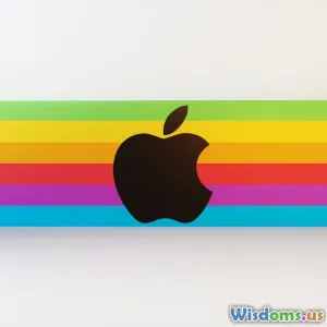
Have you ever been struck by the unmistakable simplicity of the Apple logo or the clean lines of Nike’s swoosh? These icons don’t just look good; they embody the brand’s identity and values with minimal elements. This step-by-step guide will reveal how to design such memorable minimalistic logos, walking you through every essential stage.
Understanding the Essence of Minimalistic Logos
Before diving into the design process, it’s crucial to understand
What is Minimalism in Logo Design?
Minimalistic logos focus on simplicity and the elimination of unnecessary elements. The goal is to convey the brand identity seamlessly with clean, concise visuals. Minimalism involves:
- Using limited colors — often monochromatic or duo-toned palettes.
- Employing simple geometric shapes or subtle variations.
- Favoring clarity and ease of recognition over ornamentation.
Globally revered brands utilize minimalism because it:
- Ensures scalability—logos look sharp whether on a billboard or a mobile screen.
- Makes memory retention easier — consumers remember simple shapes faster.
- Provides timelessness, avoiding dated trends that fade quickly.
Example: The FedEx logo uses a clever negative space arrow between the “E” and “x.” This small, simple visual detail encapsulates speed and precision, all within a minimalistic style.
Step 1: Define Your Brand Identity
Any successful logo begins with a deep understanding of the brand itself. A minimalistic logo must encapsulate the core values, mission, and personality of your business. Without this foundation, simplicity could turn meaningless.
How to Define Brand Identity:
- Clarify your mission and vision: Why does your company exist? What do you aspire to achieve?
- Identify your target audience: Who are you communicating with? What appeals to them visually?
- Determine brand personality: Are you innovative and futuristic, or traditional and trustworthy?
For instance, a tech startup focusing on innovation might prioritize sleek, futuristic fonts and a simple icon symbolizing connectivity, while a luxury brand might incorporate understated elegance through minimal serif fonts and restrained color schemes.
Step 2: Research and Gather Inspiration
Before sketching, immerse yourself in the visual world of minimal logos relevant to your industry.
Tips for Effective Research:
- Look at competitors’ logos to understand trends but aim to differentiate.
- Explore design platforms like Dribbble, Behance, and Pinterest.
- Analyze historical minimal logos, like those by Paul Rand — the creator of iconic logos such as IBM and ABC.
Gather an inspiration board highlighting common patterns, color schemes, and visual metaphors.
Step 3: Conceptualize and Sketch Ideas
Sketching remains one of the most valuable stages—even in the digital age. It unleashes creativity quickly and allows you to experiment freely.
Strategies for Sketching Minimal Logos:
- Start with broad concepts, focusing on shapes and symbolism rather than details.
- Emphasize simple shapes—circles, squares, lines—and see how they connect to your brand attributes.
- Explore negative space, which can add intrigue without complexity.
A great example is the WWF logo — the panda is rendered using minimal black patches and white space, creating an instantly recognizable symbol that communicates conservation through simplicity.
Step 4: Select the Right Typography
Typography in minimalistic logos is pivotal because it must convey your message clearly without distraction.
Guidelines for Selecting Typography:
- Opt for clean, sans-serif or simple serif fonts known for legibility.
- Consider customizing typography slightly to add uniqueness.
- Maintain balance between text and icon parts of the logo.
For example, Netflix’s bold, sleek letters in its logo are simple but expressive, aligning perfectly with its bold entertainment brand.
Step 5: Choose a Color Palette
Minimalistic logos usually depend on few, well-chosen colors to make an impact.
Best Practices:
- Limit colors to two or three max.
- Stick to monochrome or muted hues unless your brand personality demands vibrancy.
- Ensure high contrast for visibility on various backgrounds.
Take the example of Adidas: the black and white palette conveys a timeless, professional image adaptable to many contexts.
Step 6: Move to Digital Design Tools
When you move your sketches to software like Adobe Illustrator or Sketch, you gain precise control over shapes, proportions, and scaling.
Digital Design Focus Areas:
- Use vector graphics to maintain scalability.
- Experiment with symmetry and alignment to achieve harmony.
- Fine-tune spacing (kerning for text and whitespace balance).
Real-world Insight: Nike’s iconic swoosh was initially designed on paper, but its power truly emerged after digital refinements, making it usable on every medium worldwide.
Step 7: Refine and Simplify
This is the heart of minimalistic design — exhausting all elements until only the absolutely essential remain.
How to Refine:
- Test the logo at different sizes to ensure clarity.
- Remove any element that doesn’t contribute to brand recognition or message.
- Get feedback from diverse audiences to confirm simplicity without losing impact.
This pruning reflects a core quote by Antoine de Saint-Exupéry: "Perfection is achieved, not when there is nothing more to add, but when there is nothing left to take away."
Step 8: Test in Real-World Scenarios
Your logo must remain effective across multiple platforms and mediums.
Testing Tips:
- Apply the logo to mockups: business cards, websites, merchandise.
- Observe how it performs in black & white versus colored versions.
- Evaluate visibility on large and small formats, on digital and print.
Conclusion
Crafting a memorable minimalistic logo is a creative journey that balances restraint with expressiveness. By deeply understanding your brand, researching extensively, letting your ideas flow through sketching, selecting purposeful typography and colors, refining rigorously, and testing thoroughly, you can create a logo that stands the test of time.
Minimalism in logo design isn’t just about stripping down; it’s about distilling your brand’s essence to its purest, most captivating visual form. As Paul Rand eloquently put it, "A logo is less important than the company it represents, but it may be the company's most important single communication. It is the symbol of the company’s public face and identity."
Engage in this process with intention, and watch your minimalistic logo not only beautify your brand but become an unforgettable icon in your industry.
Ready to start? Grab a pencil and sketchpad — the next iconic minimalistic logo could come straight from your imagination.
Rate the Post
User Reviews
Other posts in Logo Design
Popular Posts


