Creating Accessibility in User Centric Design
7 min read Explore how to build accessibility into user-centric design, enhancing inclusivity and creativity in graphic design. (0 Reviews)
Creating Accessibility in User Centric Design
In an era where digital experiences shape how we live, work, and connect, accessibility has become an indispensable pillar of design. Yet, the challenge remains: How do we create designs that center the user while embracing accessibility?
Harnessing accessibility within a user-centric framework isn’t just ethical—it’s a wellspring of creativity that leads to innovative, inclusive graphic design solutions. This article explores how to weave accessibility into user-centric design, revealing strategies, insightful examples, and impactful outcomes.
Why Accessibility Matters in User-Centric Design
User-centric design prioritizes the needs, behaviors, and preferences of users. However, without accessibility, this approach risks excluding people with disabilities—an estimated 1 billion individuals worldwide, as reported by the World Health Organization.
The inclusion of accessibility:
- Expands reach: Products and designs accessible to all lead to broad user adoption and brand loyalty.
- Enhances usability: Accessibility best practices often improve the experience for every user, such as clearer layouts and intuitive navigation.
- Meets regulations: Complying with global standards (like WCAG) reduces legal risks.
Take Apple, for example. Their VoiceOver screen reader and dynamic font sizes exemplify accessibility baked directly into user-centric product design, garnering praise for inclusivity and setting design standards.
Principles of Incorporating Accessibility in User-Centric Design
Incorporating accessibility demands intentionality. The following principles guide designers:
1. Empathy-Driven Research
Effective design starts with listening. Beyond surveys and demographics, empathetic user research includes people with diverse abilities.
Example: Microsoft’s Inclusive Tech Lab invites users with disabilities to co-design products, uncovering real pain points—like software not supporting screen magnifiers—which directly informed design iterations.
2. Universal Design Philosophy
Universal Design aims to make environments usable to the greatest extent without adaptation.
In graphic design, this means colors, typography, and layouts accommodate all users, such as ensuring contrast ratios meet accessibility standards (minimum 4.5:1 between text and background per WCAG).
3. Iterative Testing & Feedback
Accessibility testing isn’t a one-off. Include assistive technologies during usability testing phases.
For example, designers can test keyboard-only navigation to ensure full site functionality without a mouse, catering to users with motor impairments.
4. Flexibility & Personalization
Address diverse user needs by allowing customization, such as adjustable font sizes or alternative color themes for colorblind users.
5. Clear Communication & Guidance
Accessibility goes beyond visuals—content must be clear and navigable for screen readers. Alt text descriptions and logical heading structures exemplify user-centric communication.
Implementing Accessibility in Graphic Design
Color Choices with Purpose
Color accessibility is a cornerstone of inclusive design. Approximately 8% of men and 0.5% of women experience color vision deficiency.
Tools like Color Oracle simulate these conditions, helping designers select palettes that work universally.
Case Study: Spotify’s redesign incorporated high-contrast UI elements after accessibility testing, enabling better usability for visually impaired users without compromising their sleek branding.
Typography That Talks
Readable typography includes consideration of size, spacing, and font choice.
Legibility improvements—like larger x-heights and open letterforms—benefit all users, especially those with dyslexia.
Insight: Studies from the British Dyslexia Association suggest sans-serif fonts like Arial or Verdana improve reading speed and reduce errors in dyslexic readers.
Layouts Tailored for All
Designs should ensure consistent, predictable navigation paths with clear focus indicators.
Responsive grids not only improve mobile experience but help users using screen magnifiers by maintaining content structure.
Imagery and Icons with Accessibility
Using descriptive alt text, ensuring icons are recognizable, and avoiding conveying information solely through images guarantees comprehension.
Materials like information graphics should come with text alternatives that summarize key data.
Tools & Techniques to Support Accessible User Centric Design
- WCAG Guidelines: The Web Content Accessibility Guidelines offer comprehensive criteria—essential for web and digital graphic design.
- Accessibility Linters/Plugins: Automated tools like aXe or Lighthouse spot issues early during development.
- Screen Readers: Tools like NVDA (Windows) or VoiceOver (iOS) should be part of the testing routine.
- User Testing with Disabled Participants: Acts as the ultimate validation ensuring design authenticity and inclusiveness.
Real-World Example: Inclusive Branding
Consider the redesign of the UK’s Royal Mail logo in 2021, where accessibility and inclusiveness were focal points. The new design employed bolder colors, simplified forms, and larger text, making it easier to read at quick glances—catering to older adults and visually impaired customers.
Conclusion: The Future of Accessibility in User-Centric Design
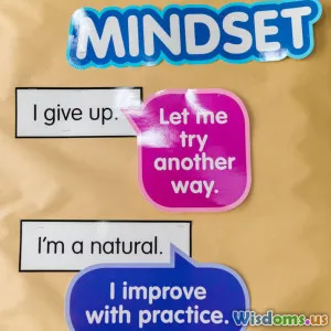
Accessibility is not a checkbox; it is an evolving mindset essential to crafting meaningful, user-centered graphic design.
By embracing empathy, universal design principles, robust testing, and adaptive creativity, designers generate products that are as inclusive as they are innovative. Accessibility amplifies creativity, turning constraints into opportunities for designing richer, more engaging experiences.
Ultimately, accessible user-centric design enriches society, opening digital doors for everyone, regardless of ability.
"Design is not just what it looks like and feels like. Design is how it works." — Steve Jobs
When accessibility leads, user-centric design follows, creating a design landscape where creativity meets compassion.
Call to Action: Start integrating accessibility today — test your designs, seek diverse user input, and push creative boundaries to make your work universally impactful.
Rate the Post
User Reviews
Popular Posts


