How to Write User Manuals for Non Tech Audiences
15 min read Learn techniques to create clear user manuals for non-tech audiences, enhancing accessibility and understanding. (0 Reviews)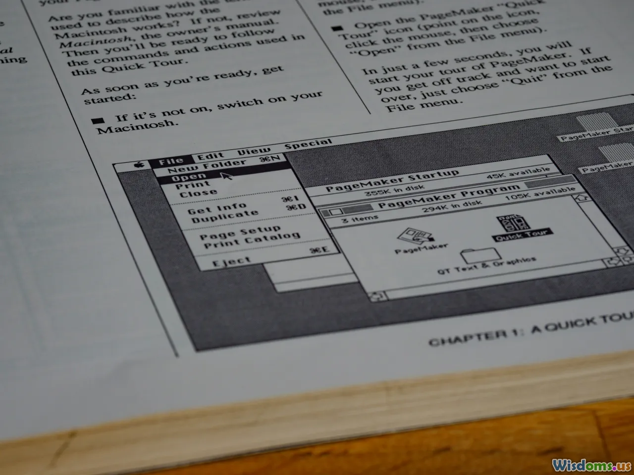
How to Write User Manuals for Non-Tech Audiences
Picture this: A customer just bought your innovative kitchen gadget. Eager, they open the box—hoping they can get started in minutes. But the manual is filled with complex jargon and intimidating procedures. Instead of excitement, confusion reigns. This scenario plays out daily—and it’s entirely preventable. User manuals are powerful bridges between product and customer, but only when tailored to their readers. When your audience isn’t technically inclined, writing must be especially thoughtful. Clarity, friendliness, and empathy win the day.
Unlock how effective documentation turns first-time users into loyal fans, no matter their technical background.
Know Your Audience

User manuals for non-technical audiences begin—and succeed—with audience insight. Before writing a word, ask: Who will use this manual? What are their likely concerns, fears, or limitations?
- Demographics: Are your readers teenagers, retirees, or busy parents? Each has distinct expectations and reading habits.
- Prior Knowledge: Avoid making assumptions, such as expecting familiarity with even basic technical terms. For example, "pairing via Bluetooth" may be second nature to some but inscrutable to others. Spell out steps with zero presumption.
- Motivation: Are the users problem-solving, learning, or troubleshooting? Manuals for purchase assembly carry a different emotional tone (excitement, impatience) than ones for support (frustration, urgency).
Tip: Build simple user profiles—"Amy, a 65-year-old retiree new to smart home devices"—and refer to them as you write. These personas keep the content grounded and accessible.
Structuring a Clear, Logical Manual

Just as a well-designed building guides visitors smoothly through, a strong manual structures information for seamless navigation.
Front-Loading Essentials
Start with a concise summary: What is this product? What does it do in straightforward terms? State safety notes up front (for example: "Read this first for your safety!") and highlight what the user can expect to achieve by the end of the manual.
Logical Progression
Guide users step by step, from unpacking to operation. Use linear sequences: do not skip or combine steps. For instance, if assembling a fan, start with unboxing, then connecting the base, then attaching blades, and so on.
Example outline:
- What’s in the box (with pictures)
- Safety notes
- Setting up (plug in, charge, assemble)
- Using the product (basic use, features)
- Troubleshooting common issues
- Support and contact information
Page Design and Headings
Use clear section headings and subheadings. Each section or chapter should cover only one major topic. Bulleted lists and callout boxes—like Tips or Warnings—break up text, making instructions less daunting.
Speaking the User's Language—No Jargon!

Technical words may seem efficient, but for non-tech users, they build walls, not bridges. Effective manuals embrace plain language.
- Avoid jargon: Instead of saying "Initialize device," say "Turn the device on for the first time."
- Define necessary terms: If you must use a potentially unfamiliar term (like "Wi-Fi network"), define it in parentheses: "Connect to your Wi-Fi network (the wireless internet your home uses)."
- Favor common analogies: "The USB port is where you plug in the charging cable, like a car’s fuel tank lid."
Real-World Example:
Original: “Enable DHCP in the router’s configuration menu.”
Revised: “Open your Wi-Fi’s settings. Look for an option called ‘DHCP’ (it lets your device pick up an internet address automatically). Make sure it’s turned on.”
By translating from technical to conversational, you remove barriers to understanding.
Visuals: Show, Don’t Just Tell

People process images up to 60,000 times faster than text +, and for non-technical audiences, visual reinforcement is gold. Too often, manuals are wall-to-wall text; step up your guides by making them visually driven.
- Annotated photos: Take high-resolution pictures showing real hands interacting with your product at each step.
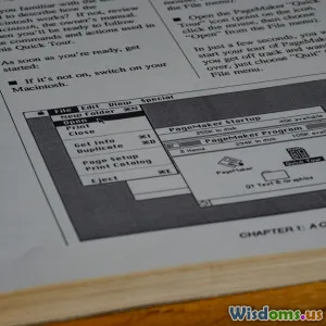
- Diagrams and flowcharts: Clear, labeled diagrams help explain, for example, what part plugs into what, or the sequence of operation modes.
- Icons and symbols: Use universal symbols (alert, checkmark) consistently, and explain what each icon means in a quick reference guide.
Example: Imagine assembling a child’s toy: A photo shows the parts laid out, each labeled A, B, C; arrows lead from Part A to Part B showing the sequence. The text reads: "Snap Part A into the slot on Part B as shown."
Step-by-Step Instructions—Sequential and Specific

Good instructions prevent costly missteps by being clear, sequential, and specific. Here’s how to build instructions that your user truly follows the first time:
- Action first: Lead each step with a verb. "Press the red button" is punchier and clearer than "The red button should now be pressed."
- One action per step: Never combine steps. Instead of "Plug in and turn on the device,” write "Step 1: Plug in the device. Step 2: Turn on the device."
- Short, manageable steps: If a step requires more than two actions, break it into smaller steps.
- Quality check after major steps: Provide easy checks (“Is the green indicator light on?”) that users can verify before moving on.
Case Example: For setting up a wireless printer:
- Unpack the printer and place it next to your computer.
- Plug the printer into a wall outlet.
- Press the ‘Power’ button. Wait for the green light to stay on.
- Open your computer’s Wi-Fi settings, and select the printer’s name.
- Enter the code printed on your printer’s sticker.
No leaps, no guesswork—just clear progress you can see.
Using Emphasis and Layout Creatively

Design makes or breaks a manual’s effectiveness. Strategic emphasis—like bold or colored text—draws attention just where it matters, while a thoughtful layout prevents information overload.
- Bolding for emphasis: Highlight key actions, warnings, or outcomes. E.g., Warning: Keep hands clear when machine is running.
- Callout boxes: For tips (“Pro Tip: Save your settings for later use”) or safety alerts, contrasting boxes ensure these critical extras aren’t missed.
- White space counts: Avoid crowding. Generous margins and breathing room between steps make reading less intimidating for hesitant users.
Design Example: Dyson’s vacuum manuals use white space, playful fonts, and illustrations, making cleaning seem accessible—not a chore.
Testing Your Manual—With Real Users

The ultimate test? Put your draft in the hands of someone who matches your audience. Observing as they work through the steps is revealing: where do they get stuck, confused, or frustrated?
- Feedback questions: Ask users what made sense vs. what didn’t. Did anything feel intimidating or unclear?
- Iterate: Modify text and images based on the feedback. Most companies ship a version 1.0 and rarely revisit it—but just one testing round can eliminate major hurdles.
- Silent observation: Watching someone follow your instructions without help can spotlight assumptions or missing info in real time.
Case in Point: Popular children’s toy company Melissa & Doug regularly brings in non-engineers (including grandparents and caregivers) to test assembly instructions. Small tweaks based on this feedback lead to much lower returns and happier customers.
Troubleshooting and Q&A—Empowering the User

Every manual for a non-tech audience should include a troubleshooting section. This single addition can save hours of customer service frustration—and builds goodwill by teaching users self-sufficiency.
- Common Problems, Plain Solutions: List issues in plain language, matching a symptom (“Device won’t turn on”) to a quick fix (“Check if the battery is charged. Plug in the charger for two hours.”)
- Simple Q&A Format: Simulate actual user questions: “What if my remote control doesn’t work?” followed by a supportive answer.
- Resource directory: Include a support email, phone number, or website for further help, clearly marked.
Real Example: IKEA’s iconic one-page troubleshooting guide features hand-drawn images next to solution steps—making it easy for all skill levels to follow without needing to read long paragraphs.
Incorporate Accessibility and Inclusivity

Go beyond basics—ensure everyone (including readers with disabilities or language challenges) can use your manual.
- Font size and read-aloud features: Use fonts that are large and simple, with spacing to aid those with visual limitations.
- Color and contrast: Ensure diagrams and important highlights use high-contrast colors.
- Multilingual options: Offer key sections in common alternative languages or feature QR codes for instant translation on smartphones.
- Screen reader compatibility: Don’t embed critical info only in images; provide alternate text so screen readers can describe visuals.
Tip: Staples’ in-store printing kiosks provide manuals in both large print and audiobook versions on request—empowering everyone, regardless of ability.
Keep Improving: Updates and User Feedback

The world—and your product—may evolve. Make your manual a living resource rather than a relic. Encourage users to submit suggestions, errors, or additional questions.
- Update frequency: If software or procedures change, revise the manual accordingly and notify users by email, app update, or printed sticky insert in packaging.
- Highlight new info: For repeat readers, make it easy to see what’s new—a “Last Updated” date on the cover, or a “What’s Changed” box at the start.
- Simple feedback channels: Provide an email or QR code where users can report confusion or suggest new topics.
Forward-thinking practice: Apple includes a “Send Feedback” link in its digital guides, blending convenience with real user influence.
When clear, compassionate manuals land in non-technical hands, something wonderful happens: intimidation gives way to empowerment. Customers engage, use, and troubleshoot with confidence. Stand out by making your manual less a barrier and more an open door. By following these strategies, you help every user—tech wiz or total beginner—get the most from what you’ve created.
Rate the Post
User Reviews


Popular Posts


