
Why Most User Manuals Fail and How to Make Yours Stand Out
8 min read Discover why user manuals often miss the mark and learn proven strategies to create clear, engaging, and effective guides that users will actually use. (0 Reviews)
Why Most User Manuals Fail and How to Make Yours Stand Out
User manuals are supposed to be the helpful guide that leads customers through a smooth experience, turning complex products into easy-to-use assets. Yet, if you’ve ever wrestled with a confusing manual or tossed one aside out of frustration, you’re not alone. Most user manuals fail to connect with their audience due to a host of fundamental issues that undermine their effectiveness.
In this article, we’ll explore the common reasons behind these failures and provide actionable tactics to create user manuals that truly stand out. Whether you’re responsible for a tech gadget, household device, or complex software, this guide offers insights to make your documentation clearer, more engaging, and genuinely useful.
Why Do Most User Manuals Fail?
1. Overly Technical Language That Alienates Users
Many manuals are written by engineers or technical writers deeply familiar with the product’s inner workings but fail to consider the end user’s perspective. This often results in jargon-heavy explanations that confuse rather than clarify.
Example: A home Wi-Fi router manual might include lines like “Refer to the DHCP configuration to assign static IP addresses via the control interface,” which overwhelm a casual user unfamiliar with networking terms.
2. Lack of Structure and Poor Navigation
Manuals packed with dense paragraphs, no clear headings, and no visual cues turn the reading experience into a scavenger hunt. Users can’t quickly find the instructions they need, leading to frustration.
Data Insight: According to a usability study by Nielsen Norman Group, users typically scan instructional content rather than reading it word-for-word, favoring well-organized documents with appropriate headings, bullet points, and summaries.
3. Ignoring the User’s Context and Needs
Failing to tailor instructions to the typical user's skill level or circumstances leads to gaps in comprehension. Instructions that don’t anticipate common questions or errors leave users stranded.
For instance, a user manual for a kitchen appliance should address not just operation, but maintenance and troubleshooting with easy-to-follow steps targeted to people cooking at home, not appliance technicians.
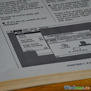
4. Minimal Visual Support
Text-heavy manuals can bore readers and obscure complex steps. High-quality images, diagrams, or videos make it easier to demonstrate processes that are hard to explain with words alone.
Real-World Insight: IKEA, known for its minimal-text assembly guides, uses clear diagrams to empower users regardless of language skills, reducing dependence on dense text and improving assembly success rates.
5. Outdated or Incomplete Information
A frequent issue, especially in fast-evolving tech industries, is that manuals fail to keep up with product updates or omit critical steps that users discover through trial and error.
This disconnect reduces trust and customer satisfaction. For instance, firmware updates often change software interfaces, making previously helpful instructions obsolete.
How to Make Your User Manual Stand Out
1. Write With Your User in Mind
Start by defining who your users are—their technical expertise, typical use cases, and pain points. Use simple, clear language and avoid jargon unless it’s explained or truly necessary.
Tip: Incorporate user personas to guide tone, detail level, and examples.
2. Organize Content Logically and Intuitively
Structure your manual using a clear outline: start with setup, then basic usage, maintenance, troubleshooting, and lastly technical specifications.
Break sections into bite-sized chunks with descriptive headings and include a detailed table of contents. Utilize bullet points, numbered lists, and highlight important steps or warnings.
3. Employ Visuals Strategically
Use images, diagrams, annotated screenshots, or infographics to illustrate key steps or complex concepts. For digital manuals, enhance this with embedded videos or interactive elements.
Example: Fitbit's user guides combine clear screenshots with step-by-step instructions, making device setup accessible even to novices.
4. Include Troubleshooting and FAQs
Anticipate common issues by incorporating a robust troubleshooting section and a FAQ page. Real-world customer support tickets can be an invaluable source for this content.
This helps users solve problems independently, easing support burdens and boosting satisfaction.
5. Update Regularly and Version Correctly
Create a process to revise and update manuals with product changes, feedback, and new insights. Clearly label versions and release dates so users can verify they have the current information.
Providing updates online also facilitates easy access to the latest manuals, supplementing printed copies.
6. Test Your Manual With Real Users
Invite unbiased users typical of your target audience to review your manual. Observe where they struggle and gather feedback to improve clarity and flow.
This ensures that your manual works as intended and meets actual user needs.
7. Leverage Digital Platforms
Digital manuals offer interactivity, searchability, and multimedia that print can’t match. Consider mobile-friendly formats that allow users to quickly find and digest information.
Some brands deploy chatbot guides or augmented reality-assisted instructions to elevate user engagement.
Conclusion: Turning Manuals Into Valuable User Resources
User manuals often fail because they’re created without empathy for the user experience, resulting in dense, confusing text that users avoid. To change this, it’s essential to center the manual design around the user’s needs, deploy clear structure, incorporate helpful visuals, and maintain up-to-date content.
When done right, a user manual transforms from a frustrating afterthought into a trusted companion that enhances product satisfaction and brand loyalty. Investing the effort into an intuitive, engaging manual doesn’t just help your customer — it benefits your business through reduced support calls, positive reviews, and differentiation in a crowded market.
Remember, a great manual doesn’t just tell users how to use a product; it empowers them to do so confidently and enjoyably.
“If you think good design is expensive, you should look at the cost of bad design.” – Ralf Speth
Use these insights to design a user manual that truly stands out and supports your customers every step of the way.
Rate the Post
User Reviews


Popular Posts


