What Every Designer Gets Wrong About Combining Script and Serif Fonts
8 min read Discover common pitfalls designers face when pairing script and serif fonts and master harmonious typography for impactful designs. (0 Reviews)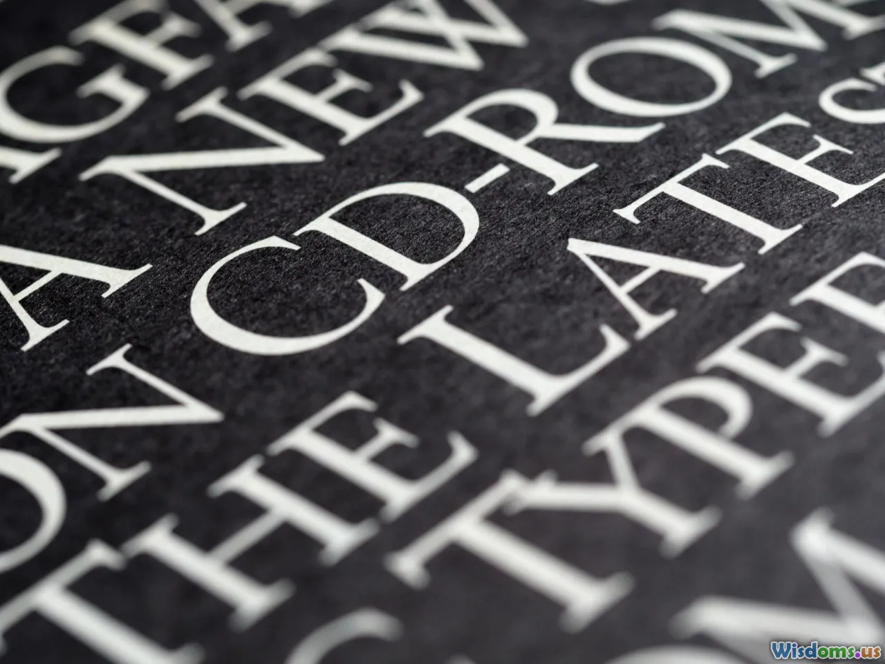
What Every Designer Gets Wrong About Combining Script and Serif Fonts
Typography pairing is an art and a science—especially when it involves marrying the expressive nature of script fonts with the more classical, structured beauty of serifs. Designer forums and portfolios abound with examples of these two styles combined, yet many look chaotic or unbalanced. This begs the question: what exactly are designers getting wrong?
In this article, we'll dissect the biggest misconceptions surrounding the pairing of script and serif fonts and provide actionable, expert advice to help you create combinations that are not only beautiful but also functional and cohesive.
The Allure and Challenge of Script and Serif Pairings
Script fonts are often chosen for their elegance and personality, mimicking calligraphy or handwritten strokes. Serifs, with their small extending features at the ends of strokes, bring a classic, formal tone and great readability.
Pairing these two styles seems natural: the polished formality of serifs contrasts well with the dynamic, flowing nature of scripts. Still, this pairing is notoriously tricky because missteps can lead to visual discord and confusion.
Common Misconceptions and Mistakes
1. Failing to Consider Contrast and Compatibility
Many designers think simply putting a script next to a serif equals harmony. Instead, successful pairing requires mindful contrast in weight, tone, and mood.
For example, pairing an ornate, highly decorative script like Bickham Script with a thick, heavy serif such as Rockwell can overwhelm the design, making it too busy and hard to digest. Instead, pairing a softer, simpler script like Lust Script with a clean, readable serif like Merriweather often yields a balanced, elegant look.
Insightful Tip: Lower contrast can homogenize designs, but overly high contrast between fonts can create confusion rather than coherence.
2. Overusing Script Fonts Without Context
Script fonts are best used as accent typefaces due to their flair and reduced legibility in long passages. Many designers make the error of employing scripts excessively, especially in body text, undermining readability and tiring the viewer.
Consider the iconic branding of Hallmark Cards: the script is reserved primarily for logos and headlines, not body copy, which is handled by clean serif or sans-serif fonts ensuring ease of reading.
3. Ignoring X-Height and Font Metrics
Sometimes, designers overlook how font sizing and x-height (height of lowercase letters) affect alignment when pairing scripts with serifs. A script with differing x-height or baseline alignment than the accompanying serif can appear disjointed.
A practical example is pairing Pacifico, a script with a tall x-height, with Garamond, a serif with smaller x-height, without adjusting line heights or letter spacing. This creates uneven flow and poor visual harmony.
Principles to Master Combining Script and Serif Fonts
1. Pair with Purpose: Define Your Visual Hierarchy
Before combining fonts, determine what role each will play. Usually, scripts function best as headers, titles, or decorative phrases to emphasize, while serifs excel in body copy or supporting text.
Consider the Vogue magazine masthead paired with Didot serif for headers and a clean serif for text. The script is constrained to a role that justifies its style without overwhelming.
2. Complement by Mood and Tone
Align fonts with the emotional tone of your project. A playful, whimsical script pairs well with a softer, rounded serif, while an elegant, formal script demands a refined, classic serif companion.
Take the branding of Tiffany & Co. — their use of scripts reflects their allure and luxury, complemented perfectly by the high-contrast Didot serif, which reinforces the elegant mood.
3. Manage Space and Size Strategically
Scripts often require more breathing room due to their flowing strokes. Balancing their size relative to serif fonts is critical.
Utilize font scaling where the script is slightly larger to draw attention, but avoid massive size differences that disrupt unity. Also, adjust line spacing to avoid letters or swashes intruding into other design elements.
4. Test Legibility Across Devices and Sizes
Thanks to the evolving digital landscape, fonts must perform well on various screen sizes. Scripts can lose legibility quickly on smaller devices.
Tip: Test your designs on mobile screens, especially when using intricate scripts next to serifs, to ensure accessibility and user comfort.
Real-World Applications and Exemplars
Wedding Invitations
Wedding invites often blend manuscript elegance with classic structure. Pairing a calligraphic script like Allura with Caslon serif creates a timeless, readable yet fancy feel—perfect for special occasions.
Branding and Logos
Brands like Kate Spade use this tactic with great success. The script adds personality and uniqueness, while the serif anchors clarity and tradition.
Editorial Design
High-quality magazines balance artistic flair and readability through prismatic typography sets. The New Yorker famously uses baselines of serif typefaces with styled script accents sparingly, maintaining elegance without chaos.
Conclusion
Pairing script and serif fonts is not a magic formula but a design conversation. The key is understanding the strengths and quirks of each font type and employing them with deliberate contrast, harmony, and purpose.
Avoid the common pitfalls like mismatched weight, overuse of scripts, and poor alignment by following typography principles rooted in readability and mood coherence.
Remember, successful typography isn’t just about aesthetics; it’s about communication. Combine scripts and serifs thoughtfully, and your designs will not just look good—they’ll speak volumes.
Typography is like a dance, and when scripts and serifs move in sync, the performance is mesmerizing.
Ready to refine your font pairing skills? Revisit your projects, and try pairing with these insights to turn mixed matches into typographic triumphs.
Rate the Post
User Reviews
Popular Posts


