
Beginner Guide to Clustering Algorithms With Practical Examples
21 min read A clearly explained beginner guide on clustering algorithms with real-world examples and step-by-step practical applications for data science enthusiasts. (0 Reviews)
Beginner Guide to Clustering Algorithms With Practical Examples
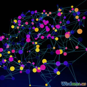
Every dataset you explore tells a story, but sometimes you need the right lens to see what groups and patterns exist beneath the surface. Clustering is that magical tool in an analyst's toolbox — a powerful set of algorithms that allow you to group similar items automatically, unveil hidden structures, and jumpstart everything from business insights to computer vision breakthroughs. For a beginner, clustering might look intimidating. This guide walks you through the basics, draws on relatable real-world instances, and highlights simple, hands-on examples so you can begin discovering clusters in your own data right away.
What Is Clustering and When Should You Use It?

Clustering is an unsupervised machine learning technique used to group samples into clusters based on similarity. Unlike classification, where data is labeled, clustering doesn’t require knowing the group tags upfront. Instead, it helps you discover structures or behaviors naturally embedded in your data.
Practical Scenarios for Clustering
-
Customer Segmentation: Marketers use clustering to group consumers based on purchase habits, demographics, or online behavior, leading to targeted campaigns.
- Example: An e-commerce platform uses clustering to identify promotion-sensitive shoppers versus premium-seekers.
-
Image Segmentation: In computer vision, clustering can separate objects from backgrounds, crucial for medical images or self-driving cars.
- Example: Separating regions of interest in X-ray scans using pixel intensity clusters.
-
Anomaly Detection: Clusters represent normal patterns; anything that doesn’t fit is flagged as an anomaly.
- Example: Banks use clustering to detect fraudulent transactions deviating from normal account activity.
Knowing when to use clustering is as important as knowing how. If you want to let the data speak for itself, especially when ground truth labels are unavailable, clustering is a strong choice.
Demystifying Distance: The Heart of Clustering
At its core, clustering revolves around similarity—quantifying how close or distant data points are. Many algorithms use the concept of distance, typically via:
- Euclidean Distance: The straight-line distance between two points in multi-dimensional space. Most intuitive and widely used for numerical attributes.
- Manhattan Distance: Sums up absolute differences across dimensions, like navigating city blocks.
- Cosine Similarity: Measures the angle between two vectors, ideal for text and sparse data.
Example: In grouping customers based on age and income, Euclidean distance visualizes shoppers in a 2D scatter plot, making clusters stand out by proximity.
Tip: Always scale your input features (e.g., using StandardScaler in scikit-learn) so that one measurement (like age) doesn’t dominate others (like annual spending).
Types of Clustering Algorithms Explained
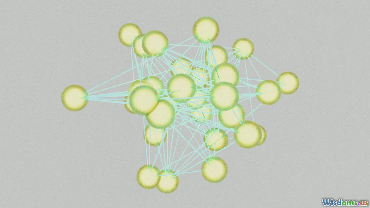
Clustering isn’t one-size-fits-all. Here’s an overview of foundational algorithm families:
1. Centroid-Based: K-Means Clustering
Perhaps the most popular, K-Means groups data by seeking cluster centers, or 'centroids,' such that each data point’s distance to its nearest center is minimized.
- Process: Pick K clusters. Randomly assign centroids, allocate each point to the nearest centroid, recalculate centers repeatedly until assignments stabilize.
- Pros: Fast, easy to implement, works well with well-separated spherical clusters.
- Cons: Needs you to specify K ahead (not always obvious), struggles with clusters of different densities/sizes.
Example: Let’s cluster students by grades and study time. With K = 3, you might find: A) top scorers who study little, B) moderate-achievers who study regularly, and C) frequent studiers who score lower — insights hidden prior to clustering.
2. Density-Based: DBSCAN
DBSCAN (Density-Based Spatial Clustering of Applications with Noise) identifies clusters as areas of high density divided by low-density regions — ideal for finding irregularly shaped groups and handling noise (outliers).
- Process: Grows clusters around 'core' points with a minimum number of neighbors within a radius (epsilon). Points not belonging to any cluster are labeled as "noise."
- Pros: No need to preset K, resistant to outliers, captures non-convex shapes.
- Cons: Sensitive to density parameters, struggles in high-dimensional spaces.
Example: Astronomers use DBSCAN to identify star clusters—densely packed stars form clusters, while scattered stars are treated as noise or isolated objects.
3. Hierarchical: Agglomerative Clustering
Hierarchical clustering gradually merges smaller clusters into larger ones (bottom-up approach), creating a tree-like structure (“dendrogram”). No need to define the number of clusters early on.
- Process: Start with each point as its own cluster, repeatedly merge the two closest clusters.
- Pros: Visual "bird’s eye view" of data via dendrograms, useful for exploratory analysis.
- Cons: Not optimal for large datasets (scales poorly), may struggle with clusters of variable sizes/densities.
Example: Geneticists cluster gene expression profiles to understand evolutionary relationships—cutting the dendrogram at different heights reveals insights at varying granularity.
Hands-On: K-Means in Action With Python

Let’s get practical! Don’t worry if you’re new to Python — tools like scikit-learn make clustering remarkably accessible.
Suppose you run a small online shop and want to group products based on price and number of purchases.
import numpy as np
import matplotlib.pyplot as plt
from sklearn.cluster import KMeans
from sklearn.preprocessing import StandardScaler

# Sample data: [price, purchases]
data = np.array([
    [10, 100], [15, 150], [16, 130], [55, 45], [58, 60], [52, 50],
    [200, 20], [220, 30], [215, 22], [205, 18]
])

# Always scale for clustering
data_scaled = StandardScaler().fit_transform(data)

# Cluster into 3 groups
kmeans = KMeans(n_clusters=3, random_state=0)
kmeans.fit(data_scaled)

# Visualize results
plt.scatter(data[:, 0], data[:, 1], c=kmeans.labels_, cmap='viridis')
plt.xlabel('Price')
plt.ylabel('Purchases')
plt.title('K-Means Product Clustering')
plt.show()
Interpretation:
- The model groups low-priced, high-purchase products; mid-priced, moderate purchase ones; and high-priced, low-purchase items. Each cluster suggests a unique marketing or stocking strategy.
Choosing the Right Number of Clusters

For most algorithms (notably K-Means), you need to estimate how many clusters the model should hunt for. But how?
The Elbow Method
This classic trick involves plotting the sum of squared distances ("inertia") against the potential number of clusters. As you add clusters, inertia drops sharply—up to a point. The spot where the curve"bends" (like an elbow) is the sweet spot.
- How-to:
- Run clustering for different K (e.g., 1–10).
- Plot cost (inertia) for each K.
- Pick the K at or just after the biggest drop.
Silhouette Score
The silhouette score measures how similar each point is to its assigned cluster vs. the next nearest, ranging from -1 to 1. Higher values mean better separation.
- Example: scikit-learn’s
silhouette_score()automatically calculates this, letting you pick K with optimal cohesion.
Advice: Try multiple methods and visualize your clusters—you’ll spot the best fit with hands-on exploration.
Sensible Preprocessing for Clustering Success

Outstanding clusters start with well-prepped data. Overlook these steps and even the best algorithm will struggle.
Key Steps:
- Handle Missing Values: Fill or drop missing data—incomplete points can skew distances. For instance, impute missing ages with the median.
- Scale All Features: Standardize or normalize to ensure each feature contributes equally. (E.g., price vs. ratings on wildly different scales)
- Remove Obvious Outliers: Outliers can distort clusters, especially for K-Means; visualize with box plots to spot and handle them.
- Dimensionality Reduction: Too many variables ("the curse of dimensionality")? Techniques like PCA (Principal Component Analysis) keep important info while reducing noise.
Tip: Skipping the above is like organizing a garage sale in the dark. Light up your data prep for crystal-clear clusters!
DBSCAN: Tackling Non-Traditional Datasets
Sometimes, your data laughs at neat spheres and sharp divisions. Clusters stretch, intertwine, and refuse straight lines. DBSCAN shines for these scenarios.
DBSCAN in Practice
Suppose you run location-based marketing and want to identify social hotspots in a city, given thousands of check-in coordinates.
- Step 1: Each check-in point is a coordinate on a city map.
- Step 2: DBSCAN identifies dense blobs of check-ins as hot zones (bars, events, malls) and dismisses scattered entries as noise.
- Step 3: No need to decide on a set number of social hotspots (clusters) ahead — the algorithm finds what fits naturally.
Python Example for Geo-Data:
from sklearn.cluster import DBSCAN

# Fake check-in data: [latitude, longitude]
geodata = np.array([
    [40.712, -74.006], [40.713, -74.007], [40.714, -74.005],  # Downtown
    [40.760, -73.982], [40.761, -73.980], [40.762, -73.981],  # Midtown
    [40.800, -73.950]   # Lone check-in, likely noise
])

db = DBSCAN(eps=0.003, min_samples=2).fit(geodata)
print(db.labels_)  # e.g., [0, 0, 0, 1, 1, 1, -1]  "-1" indicates noise
Result: You uncover two major social clusters (neighborhoods), while one odd point is ignored as isolated noise.
Hierarchical Clustering: Building Trees For Insights

Hierarchical clustering exposes how data nests and merges at various levels. Its output, a dendrogram, resembles a family tree showing how clusters branch and join.
Biological Example: Animal Taxonomy
- Each species starts as its own branch.
- Closely related species merge ('cluster') into families, then orders, and so on — illustrating natural hierarchies.
How to Apply With Python:
from scipy.cluster.hierarchy import dendrogram, linkage
import matplotlib.pyplot as plt

animals = ["fox", "wolf", "dog", "cat", "lion", "tiger", "cow"]
# Dummy data: animals embedded in feature space (e.g., size, fang length, speed, etc.)
animal_data = np.random.rand(7, 3)

linked = linkage(animal_data, method='ward')
plt.figure(figsize=(7, 3))
dendrogram(linked, labels=animals)
plt.title('Animal Similarity Hierarchy')
plt.show()
Interpretation: Cut the tree near the root for broad clusters ("wild cats" vs "canines"); go lower for detailed separation ("wolf" vs "dog"). Perfect when relationships matter as much as labels.
Choosing the Best Clustering Algorithm

Choosing a clustering approach depends on your data’s quirks and your analysis goals:
| Algorithm | Best For | Struggles With |
|---|---|---|
| K-Means | Well-separated, spherical clusters | Outliers, non-symmetric data |
| DBSCAN | Noisy datasets, irregular cluster shapes | Differing densities, high-D |
| Hierarchical | Exploratory structure, small datasets | Large scale, cut choices |
- Rule of Thumb:
- Use K-Means for straightforward groupings or high volume and speed.
- Try DBSCAN for clusters of all shapes and the possibility of noise.
- Choose hierarchical for gaining insight into relationships and granular breaks.
Real-World Example: In customer analytics, start with K-Means for a quick segmentation. If the plots look muddled or accuracy is subpar (lots of misgrouped points), try DBSCAN or hierarchical to see if the groups make more business sense.
Common Pitfalls and How to Avoid Them

Clustering is powerful — but easy to misuse. Here’s what trips up beginners, and how you can steer clear:
- Arbitrary Feature Selection: Feeding in irrelevant variables (e.g., user IP addresses for product clusters) dilutes meaningful groupings. Always brainstorm or test feature relevance.
- Ignoring Data Scale: Distances are meaningless if one variable is 1000x another. Always preprocess with scaling/normalization.
- Only Trying K-Means: Too often, analysts force all problems into K-Means. If clusters look misshapen or messy, experiment with DBSCAN or hierarchical methods.
- Overfitting With Too Many Clusters: Choosing excessive clusters splits real groups into micro-clusters. Use the Elbow or Silhouette method to guide decisions.
- Not Validating Results: It’s tempting to take cluster labels as gospel. Always visualize clusters, review cluster members, get SME (subject matter expert) feedback, and connect findings to real-world use cases.
Interpreting and Acting on Cluster Output
Clustering, though unsupervised, becomes valuable when you connect the clusters to tangible action:
- Profile Each Cluster: Calculate means, medians, and dominant features per group. E.g., ‘Cluster 1: Budget-Conscious Buyers, buys mainly electronics, aged 18-24’.
- Visualization tools like Seaborn's
pairplotor matplotlib’s scatter plots turn numbers into stories.
- Visualization tools like Seaborn's
- Deploy for Business Decisions: Tailor marketing, pricing, risk strategies, or experiences based on cluster traits.
- Iterate: Use feedback loops—as you get more data or see real-world results, reconsider clusters, features, and methods.
Example: A bank finds one customer cluster that transact mainly via mobile. They develop a mobile-first onboarding sequence just for this group, improving retention and cross-selling.
When Clustering Goes Beyond Basics: Tips for Advancement

Ready to take your skills further? Here are a few avenues as clustering grows more powerful:
- Clustering for Text Data: Algorithms like K-Means can group documents using text embeddings — for news, customer feedback, or call transcripts.
- Tools: TF-IDF (term frequency—inverse document frequency), Word2Vec, or BERT embeddings plus K-Means.
- Deep Clustering: Neural networks merge with clustering (e.g., autoencoders plus K-Means), allowing complex pattern separation on images or sound.
- Big Data Clustering: Tools like Apache Spark MLlib enable clustering across billions of samples; K-Means and hierarchical variants have distributed forms.
- Evaluation Techniques: Using bootstrapping, consensus clustering, or comparing results with labeled data introduces rigor.
- Integration with Classification: Sometimes, cluster outputs amplify classification performance—as features, inputs, or filtering steps.
Example: Netflix segments their massive user base not just by viewing categories, but also via sophisticated clustering on behavior timelines—enabling ever-finer content recommendation and customer satisfaction.
Grasping clustering is like learning to spot constellations in the vast universe of your data — it transforms chaos into order, letting the real narrative shine through. With foundational understanding, practical tools, and a pinch of curiosity, you’re ready to uncover patterns, drive insights, and bring clarity to the data stories that matter most. Happy clustering!
Rate the Post
User Reviews


Popular Posts


