
From Good to Great Transforming Boring Ad Designs
17 min read Discover proven strategies to elevate dull ad designs into impactful, high-performing visuals that capture attention and drive engagement. (0 Reviews)
From Good to Great: Transforming Boring Ad Designs
When was the last time an advertisement made you stop, think, or even smile? In today's information-rich environment, ads are everywhere—on our phones, in our feeds, and scattered across the web. Sadly, most ad designs blur together, failing to capture attention or inspire action. Exceptional ad design is more than aesthetics; it's about creating an immediate, impactful experience. So, how do we move from the mundane to the magnetic?
This guide unpacks how ordinary ads can evolve into creative powerhouses that convert, resonate, and build strong brand recall. We'll break down actionable strategies, draw on industry successes, and offer plenty of "tricks of the trade" to help your next campaign truly shine.
Understanding What Makes an Ad Boring
Bland ad designs are typically the product of playing it safe. Common issues include:
- Generic Stock Imagery: Ads recycling clichés like the smiling customer or handshake close-up lack real-world connection.
- Overused Templates: Standard layouts without customization lead to forgettable experiences.
- Cluttered Messaging: Too many details, unclear calls to action, or text-heavy compositions overwhelm rather than intrigue.
- Irrelevance: Ads that don’t speak to their intended audience get overlooked instantly.
For example, a 2023 Nielsen study found that nearly 60% of display ads on the web receive less than one second of active attention from users. That's not long enough to communicate your message, let alone persuade.
To break away from the "boring ad” syndrome, we must first recognize these traps and identify why they happen. More often than not, it's a result of assigning low priority to design, prioritizing speed over substance, or fearing bold choices.
Setting the Stage: The Psychology of Outstanding Ads
To truly transform, you need to start with the fundamentals of ad psychology. High-impact ads tap into basic human instincts:
-
Curiosity: Ads that pose a question, use unexpected visuals, or tease information spark curiosity. Apple excels here—consider the launch campaigns for AirPods, where bold white earbuds stood out against vibrant backgrounds.
-
Emotion: Brands like Nike encapsulate passion and determination through simple but powerful imagery and evocative language (e.g., "Just Do It"). Their ads rarely sell a product directly but instead sell a feeling or identity.
-
Clarity: Even the most innovative creative must deliver a clear value proposition. Simple, focused messages are remembered. Think of Google's minimal "Year in Search" campaigns, packaging data and emotion in a single headline.
In short, great ads merge psychological triggers with compelling design to deliver on both rational and emotional motivations.
Reimagining Visual Hierarchy

Visual hierarchy is how you guide the viewer’s eye—and attention—through your ad. To stand out, adopt these high-impact techniques:
1. Focal Point
Every great ad needs an anchor—be it a product, headline, or human subject. The focal point should immediately grab attention and represent your ad's core message. For example, Coca-Cola routinely uses the classic bottle silhouette as a brand-defining focal point, ensuring instant recognition.
2. Rule of Thirds & Negative Space
Strategically placing elements using the rule of thirds, a core design principle, can add energy and movement. Negative space (or white space) isn’t wasted—it's leverage. Premium brands like Chanel and luxury car manufacturers often use negative space to underline elegance and sophistication, letting products "breathe" against minimalist backgrounds.
3. Typography as Design
Variable font weights, creative kerning, and contrast between headline and supporting copy powerfully structure your message. A bold, friendly headline pairs well with a slender, understated subheading. Spotify's campaign banners champion "data-driven design," with snappy, oversized text anchoring each ad.
4. Visual Flow & Color Contrast
Leverage color theory: Use contrasting backgrounds, accent colors, and dynamic text overlays to direct gaze and highlight your call to action. McDonald's iconic billboards frequently feature bright yellow and red gradients with minimalist headlines to edge out the visual competition on busy roadways.
Breaking the Mold with Creative Imagery

Forget stiff product shots and smiling models—dynamic imagery can transform an ad from bland to breathtaking. Here’s how:
Use of Authentic Photography
Consumers respond better to real faces and true-to-life scenarios. User-generated content or location-based visuals foster relatability. Airbnb’s "Live There" campaign, featuring genuine travelers in everyday homes instead of stylized models, resulted in higher engagement rates—proving that authenticity outperforms artifice.
Illustration and Motion Graphics
Flat icons, quirky doodles, and animated figures are making a comeback. Monzo Bank’s whimsical illustrations set it apart in a staid fintech market, appealing to a young, digital-native demographic and increasing brand affinity.
GIFs, cinemagraphs, and simple video clips tell memorable micro-stories. Metro Trains' celebrated "Dumb Ways to Die" animated safety campaign went viral through colorful, character-driven animation—combining charm with a safety message and amassing billions of impressions.
Experiential Imagery
Go beyond 2D: Explore 3D renders, product-in-use shots, or augmented reality overlays. For instance, IKEA’s "Place" app lets users visualize furniture directly in their living rooms via AR, linking ad impressions directly to product trial and driving a 35% increase in click-through rates according to company reports.
Headline Mastery: Writing to Engage, Not Just Inform

Great ads are built on tight headlines that command attention and demand action. Consider the differences:
- Boring: "Upgrade to Premium Print Services."
- Great: "Make the First Impression That Lasts."
Here are some headline techniques proven to elevate:
- Surprise or Intrigue: "You Won’t Believe Where These Shoes Have Been."
- Benefit-Focused: "Sleep Better Tonight—Guaranteed."
- Power Words & Emotional Hooks: "Unlock the Adventure—Start Your Next Chapter."
- True Conciseness: Cut out filler! The best headlines rarely exceed six to eight words.
Fact: A 2021 SEMrush report found that digital ads with headline text framed as a question or teasing an outcome performed up to 14% better than neutral headlines. Don’t be afraid to test variants for each audience segment.
Making Your Brand Shine: The Power of Visual Branding
Branding is more than a logo—it’s the unmistakable signature of your identity. World-class ads balance brand recall with creative flair. Key strategies include:
Consistency Across Formats
Potent branding ensures every touchpoint looks, feels, and behaves similarly—whether it’s a Stories ad on Instagram or a banner on Spotify. Think of Netflix’s signature red and black palette or Patagonia’s recognizable mountain silhouette, which immediately flag their presence without even reading the body copy.
Subtlety Over Sledgehammers
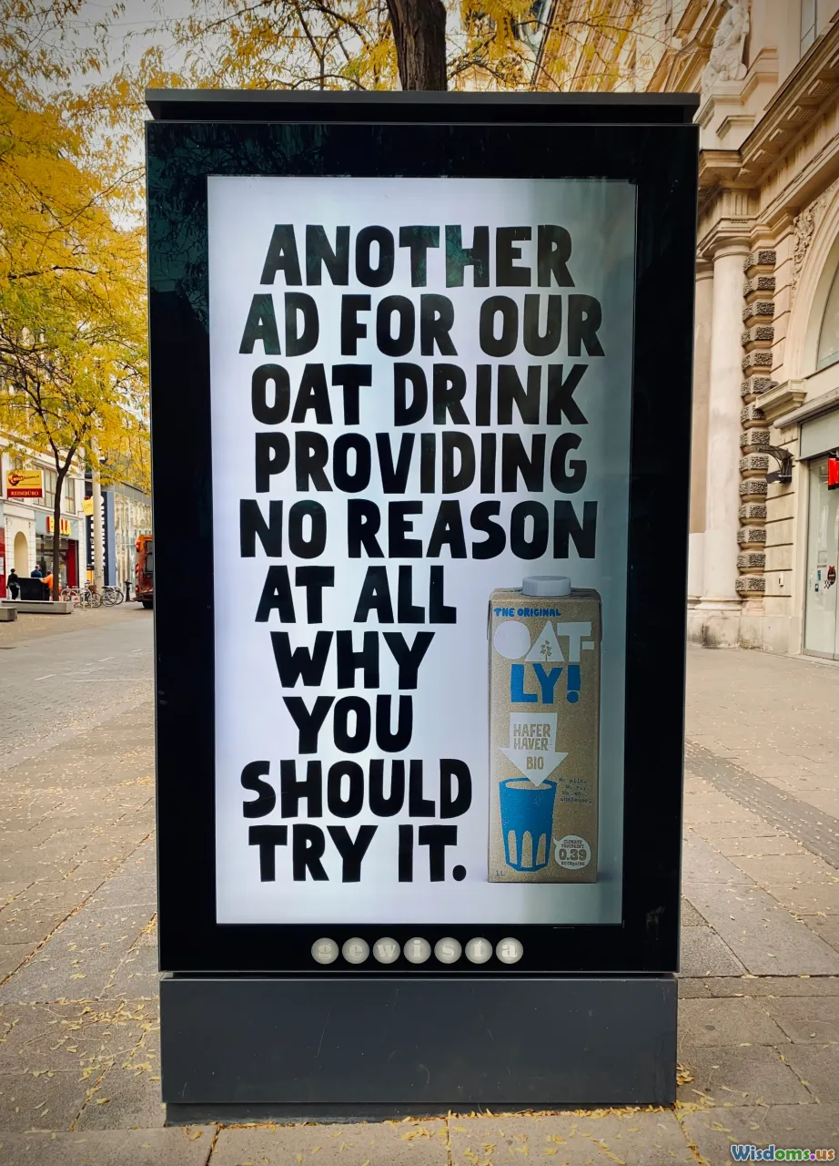
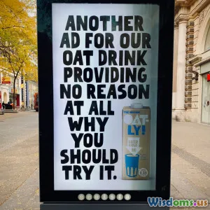
Instead of slapping the logo in every corner, integrate it elegantly with color accents, unique art direction, or signature typography. Oatly, for instance, uses bold type and quirky layouts alongside subtle color blocking to consistently build brand personality without overwhelming viewers.
Sensory Branding
If the campaign permits, augment visuals with sound cues, haptics, or novel unboxing experiences, too. While visually led, ads incorporating music—like Heineken’s UEFA Champions League spots—enhance memory association and emotional connection.
Interactivity, Experimentation, and Engagement

Static is out; interactive formats are in. These methods draw browsers into the experience:
Clickable, Swipeable, Playable
Facebook Canvas and Instagram Stories foster micro-interactions: a swipe-up, poll vote, or tap. In 2022, Samsung’s interactive "Choose Your Adventure" mobile campaign let users "build their dream device," boosting dwell time by 27% compared to pure video.
Gamified Moments
Turning ads into games (even simple quizzes or drag-and-drop puzzles) dramatically increases participation. Nike's "Reactland" campaign placed runners in a virtual video game, tracking their physical movements—a blend of innovation and brand storytelling.
User-Generated Inputs
Prompt viewers to contribute input—like uploading photos, customizing virtual products, or sharing testimonials. GoPro’s ongoing ad campaign leverages user-captured adventure footage, combining authenticity with virality.
Interactivity not only extends attention spans but also cues data-driven insights for further campaign refinement.
Data-Backed A/B Testing and Rapid Iteration

Creative brilliance alone isn’t enough—successful teams experiment relentlessly. Start by:
- Testing Multiple Variants: Run headline, image, and call-to-action tests concurrently. Adobe’s Creative Cloud campaigns cycle through dozens of banner variants weekly to hone in on best performers.
- Tailoring to Segments: Break up audiences by location, interest, or behavior and experiment across groups. For example, Coca-Cola’s global personalized bottles tapped into regional naming conventions for hyper-local resonance.
- Real-Time Feedback Loops: Leverage analytics dashboards (e.g., Google Analytics, Facebook Ads Manager) to tweak creative in response to click, scroll, and engagement data.
According to HubSpot, marketers optimizing campaigns through ongoing A/B testing can achieve up to a 50% lift in ROI over static, single-shot campaigns. The key is speed—don’t wait weeks for results; iterate and refine in real time.
Streamlined Messaging: Less Really is More

Overly complex ads suffocate the message. Instead:
- Prioritize One Core Idea: Commit to a single benefit, feature, or story—otherwise, your message gets lost in the noise.
- Whitespace-Heavy Layouts: Paradoxically, empty space draws attention to what's left. Google’s search engine ads are so effective, in part, due to extreme minimalism and focus.
- Hierarchy of Information: Place the most important message first (usually, the value proposition) and follow it with a crisp call to action.
Bose’s noise-cancelling headphones campaign is a masterclass in minimalism: black background, photo of headphones, tiny headline—"Silence."
Case Study Snapshot: Turning Bland to Grand

Let's illustrate this in practice:
The "Dull Insurance Banner" Makeover
Before: A dull blue background, generic "Affordable Insurance—Get a Quote Now" headline, and small logo in the corner.
After—Transformed:
- Real-life photography of a family happily playing in their garden (authenticity and relevance).
- Bold, benefit-driven headline: "Protect What Matters Most."
- Subtle animation with a glowing shield icon to draw focus (motion and symbolism).
- Clean design with a single call-to-action button.
Results? Click-through rate doubled and time spent on the page increased by 45%. The transformation took the ad from transactional to emotional, leveraging design, psychology, and messaging simultaneously.
Similar approaches have yielded real-world success for brands like MailChimp (from monochrome, text-heavy banners to playful animated brand characters) and Nike (switching focus from products to stories of real athletes).
Practical Tips for Your Next Great Ad Design
Here are some actionable steps to apply with your next campaign:
- Workshop the Brief: Go deeper than “sell more”—dig for emotional hooks and distinctive angles.
- Brainstorm Multiple Layouts: Don’t settle on your first draft. Try five different approaches before picking one.
- Leverage Fresh Photography: Avoid stock images—use on-brand, real photos or commission illustrations.
- Cut the Copy: If a phrase doesn’t sell, inform, or excite, remove it.
- Audit for Accessibility: Ensure fonts are legible, contrasts are strong, and content is mobile-friendly.
- Test, Test, Test: Launch at least two variants. Use the data—not just instincts—to guide you.
- Invite Feedback: Show designs to colleagues or a test audience outside your core team. Surprising insights often come from unexpected sources.
Every ad is an opportunity—not just to capture a fleeting glance, but to build resonance and drive action. The difference between “good” and “great” is rarely a mysterious magic. Instead, it’s forged through attentive design, a willingness to experiment, rigorous testing, and an unwavering commitment to authentic communication.
By abandoning safe templates, scrutinizing every visual and verbal element, and focusing on audience experience above all, your ads won’t just compete—but captivate. The journey from boring to bold starts with a single decision: dare to design differently.
Rate the Post
User Reviews


Popular Posts


