Unconventional Infographic Designs That Broke the Mold
23 min read Explore groundbreaking infographics that defied conventions, why they worked, and how to adapt their tactics responsibly. (0 Reviews)
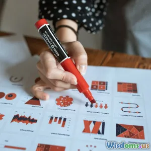
Some infographics don’t just summarize data—they redraw the rules of how information can look, feel, and behave. While most charts stay safely inside rectangles, standard axes, and familiar palettes, a handful of designers have broken the mold with shapes, narratives, and even edible experiences that make audiences see data with fresh eyes. This article explores those rule-bending designs, why they worked, and how you can apply similar thinking—without sacrificing clarity or credibility.
Why Break the Mold in the First Place?

Most audiences scroll past charts not because they hate data, but because the format feels routine. Breaking conventions isn't about being flashy; it's about renewing attention and deepening understanding. Unique, well-reasoned infographic designs can:
- Trigger the von Restorff effect (the “isolation effect”), where distinctive visuals are more memorable than similar ones.
- Reduce cognitive friction by matching form to story. For example, circular timelines make cycles obvious; flows that bend and split make movement visible at a glance.
- Invite exploration and participation, turning readers into co-investigators rather than passive consumers.
However, unconventional doesn’t mean incomprehensible. The best examples anchor novelty in familiar cues—clear labels, consistent legends, and just enough scaffolding to let users feel confident as they navigate something new.
When the Canvas Isn’t Rectangular
One of the simplest ways to challenge expectations is to change the shape.
- Florence Nightingale’s polar area (coxcomb) diagrams (1858) reframed mortality data from the Crimean War. By allocating months around a circle and sizing wedges by deaths, she transformed a time series into a blooming, visceral argument: preventable disease dwarfed battle injuries. The circle wasn’t a gimmick; it efficiently compressed a year and highlighted the seasonality of deaths.
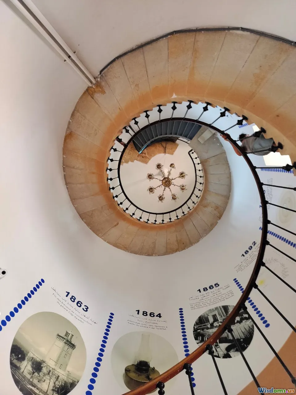
- Spiral timelines leverage our innate sense of cycles. For phenomena like circadian rhythms, energy use across the day, or seasonal sales, spirals can condense multiple cycles into a single plane, revealing recurring peaks that a linear timeline can bury.
- Wind roses and radial histograms show directional distributions in a way a rectangular histogram struggles to match. Meteorology, traffic flows around roundabouts, and even retail footfall can benefit from direction-aware radials.
Tips for non-rectangular canvases:
- Declare your mapping explicitly. On a polar chart, note what angle, radius, and color encode.
- Avoid arc-length illusions. Area, not radius, should represent magnitude in wedges; otherwise the visual exaggerates large values.
- Provide a small linear inset for readers who want exact comparisons.
Flow, Topology, and When Geography Isn’t the Point

Some of the most influential unconventional infographics deform space to clarify patterns.
- Charles Joseph Minard’s 1869 depiction of Napoleon’s 1812 Russian campaign used band width to encode army size, a temperature line for the return, and a topographic route to preserve context. It’s part map, part timeline, part flow—a hybrid that inspired generations of designers.
- Massimo Vignelli’s 1972 New York City Subway diagram abandoned geographic accuracy in favor of an abstract network with 45- and 90-degree angles. Purists objected, but passengers gained a topological guide that reduced cognitive load for route planning.
- Cartograms resize regions by a variable (population, emissions, votes). Dorling cartograms replace regions with circles sized by value, freeing the viewer from misleading area impressions. For instance, a U.S. election cartogram by population reveals the dominance of cities that’s invisible on a standard county map.
When to break geography:
- If physical distance matters less than connectivity (e.g., subway maps) or proportional importance (e.g., disease burden by region), topology or cartograms clarify the core question.
- If spatial relationships are crucial (e.g., flood risk by elevation), keep geographies intact and innovate elsewhere (e.g., multi-layer shading, animated contours).
Hand-Drawn, Imperfect, and Irresistibly Human

Not all infographics should look machine-perfect. The hand-drawn aesthetic can convey care, uncertainty, and approachability.
- Dear Data (2015) by Giorgia Lupi and Stefanie Posavec turned weekly personal datasets—sounds overheard, doors opened, compliments given—into hand-drawn postcards exchanged across the Atlantic. Each week’s design used a new legend, shape system, and color meaning, with the rawness of pen marks drawing readers into a diary-like intimacy. The project was later acquired by MoMA, testifying to its cultural impact.
- Mona Chalabi’s hand-drawn graphics, often about social issues, accept imprecision when the data is uncertain and emphasize the human stakes. Imperfect lines become a subtle cue for “estimate,” which is often more honest than pseudo-precision.
- xkcd’s “sketch” style shows how humor and faux-handwriting can clarify complex ideas without dumbing them down. In the famous “Money” poster, a single, absurdly long scrolling canvas normalizes scale through consistent blocks, all wrapped in a comic’s casual tone.
Guidance:
- Pair hand-drawn forms with rock-solid legends. The more idiosyncratic the marks, the more crucial the key.
- Use repeatable primitives (dots, ticks, icons) to keep quantitative comparisons valid.
- Treat imperfections as signals of uncertainty, not sloppiness. Annotate estimates and ranges.
Physical, Edible, and Installational Infographics

Some of the most memorable infographics escape the screen entirely.
- Data Cuisine workshops (from 2012, by prozessagenten with Moritz Stefaner) translate datasets into dishes. Spiciness might encode unemployment rates; portion sizes reflect population. The medium creates a multisensory hook—taste as a metaphor and memory aid.
- Nicholas Felton’s Annual Reports (2005–2014) cataloged a year of his life—emails sent, locations visited, drinks consumed—through exquisitely designed print booklets. The autobiographical data plus print finish turned “infographic” into an object you keep, not a link you forget.
- Museum data sculptures—3D-printed city skylines by income, or ribbon flows representing migration—capitalize on embodied cognition. Visitors grasp volume, slope, and intersection by moving around the piece.
How to do physical well:
- Choose encodings that survive low resolution and viewing distance. Shape and volume trump tiny labels.
- Make the legend part of the object—etched on acrylic bases, printed on coasters, stamped into packaging.
- Consider durability and ethics. Edible data is fun, but think about waste; design for consumption, not landfill.
Narrative and Participatory Infographics

When a chart becomes a story, readers stay longer. When it invites action, they remember what they did.
- The New York Times’ “You Draw It” series (2015) let readers sketch a line predicting, for example, how family income affects the chances of attending college, before revealing the real data. The interaction surfaces prior beliefs, then confronts them with evidence—an elegant use of audience participation to deepen learning.
- Scrollytelling packages complex transitions into a linear journey. Rather than showing all layers at once, an article might reveal them step by step—first baseline, then anomalies, then causes—so each frame gets cognitive spotlight.
- Animated transitions that morph one chart type into another (e.g., map to bar chart, or scatter to histogram) help readers maintain “object constancy,” preventing the confusion that comes with an abrupt format jump.
Practical advice:
- Limit the number of unique interactions; each new gesture must earn its keep.
- Provide fallback states. If JavaScript fails, readers should still see a meaningful static layout.
- Summarize the key finding in plain text near the interactive; not everyone will play along.
Breaking Axes, Scales, and Projections

Axes are contracts with the reader. You can bend them—but break them responsibly.
- Logarithmic scales tame exponential growth (pathogens, startups, compound interest). Use faint gridlines and clearly labeled powers of ten; add a “log scale” tag directly next to the axis so no one misses it.
- Spiral and radial layouts for time and sequence can reveal periodicity. A radial Gantt for a 24-hour schedule may make night/day shifts immediately legible.
- Joy Division’s 1979 “Unknown Pleasures” album cover popularized stacked line plots of pulsar CP 1919’s radio signal (from Harold D. Craft Jr.’s thesis work). While not published as a traditional infographic, it highlights how scientific traces can be repurposed as powerful cultural graphics. The lesson: expressive form emerges when you amplify the signal and reduce the rest.
Cautions:
- Watch for compression artifacts in non-linear scales; small differences at the low end can vanish.
- If you warp space (cartograms), give readers a locator map or a toggle to the standard projection.
- Use direct annotations on critical points; axes alone may not be enough in unconventional layouts.
Mini Case Studies: Designs That Shifted Expectations
- Florence Nightingale’s Coxcomb (1858): A circular time series that made disease’s toll unmistakable and helped drive sanitary reforms. Actionable takeaway: match geometry to story; here, circular months argued for seasonality and prevention.
- Charles Minard’s March to Moscow (1869): A multi-encoding masterclass—width for troop strength, path for route, temperature for return—without clutter. Takeaway: hybrid designs can work if each encoding does unique work.
- W.E.B. Du Bois’s Data Portraits (1900): Bold, color-rich diagrams created with students at Atlanta University for the Paris Exposition. They defied the era’s drab charts and framed Black life with dignity and modernity. Takeaway: design is political; color and composition carry values, not just values.
- Vignelli’s NYC Subway Diagram (1972): Geography sacrificed for usability. Takeaway: map what matters; when the task is wayfinding, topology beats topography.
- Dear Data (2015–2016): Personal narrative plus hand-drawn rigor turned small, everyday signals into a museum-worthy archive. Takeaway: intimacy can be a data strategy.
- NYT “You Draw It” (2015): Interactivity as hypothesis check. Takeaway: let readers be wrong, then make them curious about why.
- Dorling Cartograms in Election Coverage: Circles sized by population corrected misleading land-area effects. Takeaway: rescale the world to the question, not the other way around.
How to Design a Rule-Breaking Infographic (Without Confusing People)

- Start with the job-to-be-done
- What decision or insight should this graphic enable? If the outcome is “choose a route,” consider topology; if “spot cycles,” consider radial time.
- Pick one convention to break—on purpose
- Change shape, narrative structure, or interaction—not all three at once. Controlled novelty is safer than chaos.
- Sketch multiple metaphors
- Is your data a journey (flow), a pulse (time series), a garden (growth over seasons), or a conversation (nodes and exchanges)? Draw three thumbnail ideas per metaphor before committing.
- Establish a visual grammar
- Define encodings for shape, size, color, stroke, texture. Hand-drawn or digital, a consistent grammar keeps the reader oriented.
- Annotate aggressively
- Use plain-language callouts for anomalies, trend lines, and definitions. An unconventional form needs extra signposts.
- Test comprehension early
- Show a pencil sketch to a colleague for 90 seconds. Ask: “What’s the main point? What confused you?” Iterate before you polish.
- Build in accessibility
- Minimum 4.5:1 contrast for text over backgrounds; avoid red-green reliance. For interactivity, provide keyboard navigation and data table fallbacks. For physical pieces, make legends easy to reach and read.
- Decide what precision means here
- If it’s exploratory or qualitative, ranges and density may be better than exact counts. If it’s regulatory or financial, keep scales linear and readable.
Tools and Techniques for Unconventional Layouts
- Vector design: Adobe Illustrator, Affinity Designer, Figma. Great for custom shapes, non-standard canvases, and meticulous label work.
- Data to vector bridges: RAWGraphs (quickly output Sankey, alluvial, and radial charts to SVG), Data Illustrator (experimental tools), and Flourish for interactive templates you can push beyond defaults.
- Code-first: D3.js for custom projections, transitions, and scrollytelling; p5.js for expressive sketch-like visuals; Observable for iterative, shareable notebooks.
- Maps and topology: QGIS for preprocessing, TopoJSON and Mapshaper for simplification and cartograms, Kepler.gl for quick exploratory mapping.
- Physical: Laser cutters for acrylic legends, 3D printers for volume encodings, risograph or letterpress for tactile prints with intentional imperfections.
Workflow tips:
- Separate data prep from design. Clean and model in Python/R; export narrow, chart-ready tables to keep visual layers simple.
- Label last, but plan for labels first. Reserve whitespace and anchor points in the layout early so you don’t fight for space later.
- Package variants. For the same story, prepare a static share image, an interactive for web, and a print-safe PDF.
Measuring Impact: Did the Rule-Break Pay Off?

A bold graphic is a risk. Treat it like a hypothesis and measure results.
- Comprehension tests: Before launch, run quick A/B tests. Which version yields more correct answers to simple questions after a 30-second view?
- Time-on-graphic: Use scroll depth and mouseover time to gauge engagement. More time isn’t always better—if the graphic blocks progress because it’s confusing, you’ll see rage clicks or abrupt exits.
- Recall and shareability: Ask a small panel to explain the key point an hour later; track social shares with meaningful commentary (not just retweets).
- Qualitative feedback: Watch five people use the piece. Note where they hesitate, zoom, or re-read labels. Small sample usability studies catch big problems.
Define success criteria upfront. For a newsroom, success might be dwell time and completion; for a public health poster, it’s message recall and behavior change.
A Creative Brief Template for Unconventional Infographics

Use this one-page brief to align stakeholders before you start breaking rules.
- Objective: What decision or insight will this enable?
- Audience: Who are they? What do they already know? What devices or contexts (mobile, print, museum)?
- Core metaphor: Journey, cycle, anatomy, constellation, mosaic—pick one.
- Novelty axis: What convention are we breaking and why?
- Data sources and confidence: What’s solid? What’s estimated? Where are the ethical guardrails?
- Accessibility plan: Color strategy, alt text or captions, keyboard access, print legibility.
- Measuring success: Metrics and methods, from comprehension questions to time-on-graphic.
- Deliverables: Formats, sizes, and variants (static, interactive, physical).
- Risks and mitigations: Confusion points, technical dependencies, fallback states.
Checklist and Common Pitfalls

Do
- Start with a strong legend and consistent visual grammar.
- Use annotations to narrate key moments.
- Prototype quickly in low fidelity (paper, sticky notes, grayscale SVG).
- Test with real users; watch, don’t explain.
- Keep data ethics front and center—show uncertainty, cite sources, respect privacy.
Don’t
- Break axes without shouting it in labels.
- Use novelty for novelty’s sake; each flourish needs a narrative job.
- Depend only on color differences; add shape or texture for accessibility.
- Overload interactivity; one or two gestures are usually enough.
- Forget performance; a 15MB animation will lose mobile users.
A Short Comparison: Conventional vs. Unconventional Approaches

- Conventional bar chart vs. radial bar chart: Bars are easier for precise comparison; radial bars shine when emphasizing cycles or directions. If policy or finance is at stake, prefer linear bars; if narrative engagement matters more, radial can be effective.
- Geographic map vs. cartogram: Maps honor spatial location; cartograms honor proportional importance. Election education favors cartograms; evacuation planning demands real maps.
- Static figure vs. scrollytelling: Static is fast and portable; scrollytelling can choreograph complexity. For social media, static wins; for investigative features, scrollytelling can carry the reader step by step.
Bringing It All Together: Your Next Bold Infographic

The examples above—Nightingale’s coxcomb, Minard’s flow map, Du Bois’s vibrant plates, Vignelli’s schematic subway, Dear Data’s postcards, and participatory interactives like “You Draw It”—share a mindset, not a style. They start from the question, shape the form to the story, and then work tirelessly to make the unfamiliar usable.
If you’re considering an unconventional design, pick one rule to bend and bend it with care. Use distinctiveness to grab attention, then structure, labels, and narrative to hold it. Prototype fast, annotate generously, test with real people, and measure what matters. The goal isn’t to look different. It’s to make people see differently—and remember what they’ve seen long after the tab is closed or the poster comes down.
Rate the Post
User Reviews


Popular Posts


