
Step by Step Guide to Creating Interactive Infographics
20 min read Learn how to create engaging interactive infographics with this comprehensive, step-by-step guide. (0 Reviews)
Step by Step Guide to Creating Interactive Infographics
Infographics have evolved from static visuals into dynamic, interactive experiences that captivate audiences, clarify complex ideas, and boost engagement rates across digital platforms. Whether you're a seasoned designer or a passionate educator, interactive infographics can elevate your content, making data and storytelling immersive and memorable. Ready to breathe life into your data-driven stories? Follow this comprehensive, actionable guide to mastering interactive infographics from planning to launch.
Understanding the Power of Interactive Infographics

A decade ago, infographics burst onto the content marketing scene as creative ways to compress information into a visually enticing package. Today, interactivity adds an entirely new dimension: it encourages users to engage directly with the information, deepening understanding and prolonging site visits.
Why Go Interactive?
- Immersion: Users can click, scroll, or hover to personalize their experience.
- Enhanced Learning: Studies show interactive content increases retention rates by up to 70% compared to passive reading or viewing.
- Shareability: People are more likely to share interactive content, increasing reach and backlinks.
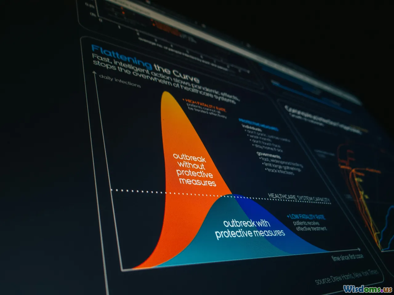
Example: The New York Times regularly produces interactive graphics for major news stories. Their 2020 election map let users explore votes at a state and county level, customizing the data they see.
Define Clear Objectives for Your Infographic

Jumping straight into design is tempting, but clear objectives put your project on the right track and help measure its impact.
Start by Addressing These Questions:
- Who is your target audience? Are you appealing to data-savvy professionals, students, or the general public?
- What story or insight do you want to communicate?
- Which outcome do you hope for (eg. user education, brand awareness, conversions)?
For example, if you're a healthcare organization wishing to inform patients about the symptoms and treatments of diabetes, your infographic should focus on clarity, accessibility, and intuitive navigation.
Action Point: Write a one-sentence goal such as: "Enable users to compare renewable energy sources in the U.S. by interactivity with dynamic state-level data."
Gathering and Structuring Your Data

Strong interactive infographics rely on quality data and a logical structure. This phase is the backbone of your project.
Where to Find Data
- Open Data Portals: Government sites like Data.gov or the World Bank Data.
- Surveys & Polls: Gather insights directly from your audience using tools like Google Forms.
- Internal Reports: Company-generated metrics can be goldmines for unique visuals.
Key Tips for Data Structuring
- Cleanliness Counts: Remove duplicates, fix inconsistencies, and fill in missing values using spreadsheets.
- Hierarchy Matters: Break the information into bite-sized sections, making it easier for interactivity (e.g., grouping facts by category, timeframe, or geography).
Example: For a public health infographic, you might organize data as "Symptoms," "Prevention," and "Treatment." Each category could have clickable elements for deeper exploration.
Choosing the Right Interactive Elements

Interactivity covers a wide range of tools, from simple show/hide toggles to rich animations and branching stories. Selecting the right format depends on your goals and audience.
Popular Interaction Types
- Click-to-Reveal/Expand: Show more info upon request. Useful for explanations or comparisons.
- Hover Effects: Highlight or display data snippets when the cursor passes over areas — ideal for desktop experiences.
- Dynamic Charts/Graphs: Let users filter or adjust datasets in real-time.
- Sliders and Timelines: Explore data changes over time or through stages.
- Maps: Enable exploration of data segmented by region.
Case Study: The Census Bureau's population clock allows users to adjust year ranges and geographic scopes and instantly see updated visualizations of populations worldwide.
Tip: Always align interaction complexity with your audience. For internal B2B dashboards, advanced interactivity can shine. For public-facing explainers, prioritize clarity and simplicity.
Storyboarding and Wireframing Your Infographic

Jumping straight to development is a common pitfall. Storyboarding helps clarify flow, prioritize information, and visualize user journeys before any coding or detailed design work begins.
How to Start
- Thumbnail Sketches: Quickly draw out small rectangles representing different content sections.
- Layout Mapping: Arrange modules in a logical visual flow. Decide how users will scroll, swipe, or click.
- Interactivity Notes: Mark where interactive elements go. For instance, place [button]‘see details’ where more info pops up; designate map areas for zoom functions.
Tools for Digital Wireframing:
- Figma: Interactive prototyping and collaboration.
- Balsamiq: Lo-fi wireframes for rapid ideation.
- Miro: Collaborative whiteboard for story and flow mapping.
Insight: Storyboarding clarifies whether your intended interactivity actually enhances the story. If any feature seems forced or confusing, rework it at this stage—saving hours in development later.
Crafting Engaging Visuals: Design Principles

Your data may be powerful, but poor design undermines its credibility and appeal. Interactive infographics blend aesthetics with function for a seamless user experience.
Key Design Principles
Consistency: Use a restrained color palette (usually 3–5 colors) drawn from your branding and select 1–2 clean, legible fonts.
Visual Hierarchy: Draw eyes to important information through size, shade, and placement. Headers, key figures, or buttons should command attention.
White Space: Particularly with interactive elements, space around items prevents visual clutter and mis-clicks.
Accessibility: Ensure sufficient color contrast, use clear labeling, and consider alt tags for images or ARIA roles for interactive SVGs.
Example: Data-Driven Dashboard
Many financial infographics use dashboards where key metrics are visually prioritized through bold colors, while less urgent info appears in muted tones. Interactive modules, like dropdowns to select fiscal quarters, follow the same color and space rules for instant usability.
Selecting the Right Tools and Platforms
A variety of platforms exist for creating interactive infographics, from beginner-friendly editors to professional-level toolkits. Your choice depends on skill level, budget, and the complexity of interactions desired.
No-Code and Low-Code Solutions
- Canva Pro: Offers animated charts and clickable elements.
- Visme: Builds data-powered infographics with clickable modules and transitions.
- Piktochart: Supports embedded live charts and basic user interaction.
For Developers and Advanced Users
- Adobe Illustrator + Figma (with plugins): Combine layered graphics exported to web tools for interactive overlays.
- D3.js and Chart.js: JavaScript libraries for complex, bespoke interactivity on the web.
- Google Data Studio: For dashboard-like infographics with real-time data.
Comparison Table:
| Tool | Pros | Cons |
|---|---|---|
| Canva Pro | Fast, easy, great templates | Limited advanced logic |
| Visme | Strong data visualization | Costly for full feature set |
| D3.js | Ultimate customization | Steep learning curve |
| Figma | Modern design/prototype workflow | Some plugins paid |
Action: List your must-have features (e.g., clickable maps, filter sliders) before selecting a platform. Trial free versions to assess ease-of-use and export options.
Bringing It All Together: Prototyping and Iterative Testing

Before unveiling your infographic to the world, it's critical to prototype and test. Even the most beautiful, data-rich visual can fail if users get frustrated or miss key information.
How to Prototype
- Clickable Mockups: Tools like Figma or InVision let you link buttons, menus, or slides for a pseudo-interactive experience.
- User Scripts: Prepare realistic user tasks, such as "find the trend in renewable energy use in 2023" and observe.
Usability Testing Tips
- Gather a small group matching your core audience — ideally 5-8 people.
- Ask them to narrate their thought process as they interact.
- Look for confusion, missed clicks, or disengagement.
Feedback Example: Testers for a transport routes infographic struggled with map color-coding. The designers added a persistent legend and short tooltip explanations, reducing confusion by over 50% in retesting.
Pro Tip: Adjust early and often. The most elegant designs come from flexible, user-focused iteration at the prototype phase rather than last-minute fixes.
Adding Interactivity: Practical Implementations

Once feedback is positive, it’s time to build real interactivity into your infographic.
Common Techniques by Platform
In No-Code Tools:
- Assign actions to buttons or icons, such as reveals, slide transitions, or chart updates within the editor.
- Embed widgets, such as maps from Google Maps or interactive graphs via iframe, using readily supplied modules.
In Custom Code (e.g., D3.js, React):
- Break the content into interactive components (e.g., charts, filters, or info panels).
- Use event listeners to respond to clicks, hovers, or swipes, updating displays dynamically.
Example: An agriculture data infographic might allow users to hover over states on a map and see animated trend-lines for crop yields over decades.
Animation Do's and Don'ts
- Do: Use subtle transitions, such as fading in data or smoothly expanding panels.
- Don't: Overwhelm users with rapid-fire motion or distracting effects, which can distract from the data.
Ensuring Responsive and Cross-Platform Functionality

Your audience could be viewing your infographic on a desktop, tablet, or smartphone. Responsive design is absolutely essential.
Actionable Tips:
- Test Across Devices: Use browser tools to preview mobile, tablet, and desktop renders.
- Adaptive Layouts: Stack or reflow content blocks for smaller screens; replace hover states with tap/click events on touch devices.
- Font and Button Scaling: Ensure text stays legible and buttons stay tappable—even on small screens.
Example: An interactive infographic for a non-profit adjusted bar graphs into easy-to-scroll carousels for mobile, improving interaction rates by 40% on phones versus original desktop-only design.
Optimizing for Performance and SEO

Impressive interactivity is moot if your infographic loads slowly or can't be discovered by search engines.
Checklist for Speed and Visibility:
- Optimize Images and Graphic Assets: Compress images and export SVGs efficiently for web use.
- Lazy Loading: Only load modules as they become visible to the user.
- Accessible Data: Supplement interactive canvases with HTML tables or ARIA attributes so content is visible to screen readers and search engines.
- Descriptive Metadata: Include alt tags, logical naming conventions, and a concise, keyword-rich description for embedding and sharing.
Real-World Example: A B2B SaaS company added meta descriptions and accessible code to their infographic, increasing inbound traffic by over 60% in three months.
Techniques for Promotion and Embedding

Publishing is just the beginning—seed your infographic across the right digital channels to amplify its impact and glean measurable results.
How to Promote
- Embed on Site: Use iframe codes or responsive containers; provide easy-to-copy embed snippets for colleagues or partners.
- Share on Social: Export teaser GIFs or short video walkthroughs. On LinkedIn, Twitter, and Facebook, link to the full interactive version.
- Email Newsletters: Include a screenshot or short animation with a CTA linking out.
- Pitch to Media: Outreach to bloggers and journalists with relevant audiences offers an excellent path to virality and organic backlinks.
Example: After hosting an interactive carbon footprint tool with clear embedding instructions, a sustainability blog picked up the story, quadrupling referral visits in a fortnight.
Measuring Impact and Iterating for Success
To demonstrate ROI and keep your content at the cutting edge, consistently monitor performance and iterate where needed.
What to Track
- Engagement Rates: Number of interactions/clicks per feature; time-on-page.
- Completion Metrics: How many users explore all key interactive areas?
- Conversion Figures: Downloads, shares, or lead form fill-outs from the infographic.
- Traffic Sources: Where visitors are coming from—social, referral, search?
Tools to Use
- Google Analytics with custom event tracking.
- Hotjar or Microsoft Clarity for heatmaps and session recording.
- Built-in Analytics from Visme, Canva, or other creation tools.
Insight: Major organizations regularly iterate their most-used interactives. Refresh styling, add data modules, or update numbers as datasets evolve to keep content relevant and high-performing.
Crafting an interactive infographic doesn't require deep technical know-how—just a clear objective, good data, a focus on usability, and the right tools. By thoughtfully guiding users through your story with hands-on engagement, you'll distinguish both your message and your brand as innovators in the digital storytelling space. Start sketching your idea, explore available platforms, and experiment fearlessly: your audience awaits immersive new ways of discovery.
Rate the Post
User Reviews


Popular Posts


