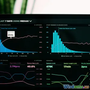
Top Trends in Graphic Design for Data Visualization Today
9 min read Explore cutting-edge graphic design trends transforming data visualization with engaging aesthetics and enhanced clarity today. (0 Reviews)
Top Trends in Graphic Design for Data Visualization Today
In an era where data is termed the new oil, rendering that data in an intuitive, meaningful manner becomes indispensable. Graphic design for data visualization is no longer a mere accessory but a central pillar that dictates how information is perceived, digested, and acted upon. A compelling data visual can elevate insights from dry numbers into impactful narratives that drive decisions across sectors.
This article dives deep into the top graphic design trends currently shaping the domain of data visualization. Whether you’re a data scientist looking to better communicate findings, a designer seeking inspiration, or a business leader aiming to leverage data-driven storytelling, these insights offer practical cues on enhancing your visual communication.
1. Immersive 3D Visualizations
Traditionally, data visualizations have been predominantly 2D, but advances in rendering technology and hardware capabilities have spurred a surge in 3D data visualizations. The use of three-dimensional space allows designers to add depth and nuance, making complex datasets more accessible.
For example, Bloomberg's Market Data visualization integrates subtle 3D effects, letting users perceive relationships between multiple variables spatially. The 3D perspective clarifies clustering, density, and hidden patterns that flat charts might obscure.
Research by the Pew Research Center also indicates users engage longer and report higher satisfaction when exploring visualizations with realistic depth cues and smooth transitions.
However, designers must take care to keep interactivity intuitive. Overly complex 3D models can confuse users if navigation does not remain straightforward.
2. Minimalism with Strategic Use of Color
As data grows in volume, an emergent trend is the shift towards minimalist design. A clean, decluttered interface helps users focus on what's important without overwhelm. But minimalism does not imply dullness.
Modern visualizations use carefully curated color palettes to attract attention to key data points or trends while keeping the overall canvas serene. Spotify’s streaming analytics dashboards exemplify how subdued backgrounds paired with vibrant accent colors guide users’ eyes effectively.
Moreover, there’s growing emphasis on color accessibility — employing palettes that cater to various types of color blindness. Tools like ColorBrewer assist designers in selecting perceptually distinct colors, ensuring inclusivity across diverse audiences.
3. Animated and Micro-Interaction Enhancements
Animations are no longer gimmicks; they play a critical educational role in guiding users through transitions, illustrating data changes over time, and simplifying abstract concepts.
The New York Times frequently employs seamless animated transitions in its COVID-19 visual dashboards, helping readers understand temporal trends naturally, as the data animates from one time point to another.
Similarly, micro-interactions such as hover tooltips, dynamic labels, or subtle bouncing dots reinforce user engagement and provide immediate feedback, making complex sets easier to explore. However, pacing is key — animations must be smooth, fast enough to keep interest but slow enough to be meaningful.
4. Storytelling Through Integrated Infographics
Data visualization now blends increasingly with storytelling frameworks. Instead of isolated charts, designers build infographic sequences and modular panels that narrate a persuasive story.
For instance, the Guardian’s “Children in Lockdown” report uses a combination of charts, illustrative icons, and text blocks intertwined in a linear, scrollable visual essay. This approach elevates the reader experience by providing context, emotional cues, and a clear message trajectory.
Data storytelling fosters empathy and retention, making insights not just understood but felt. As renowned visualization expert Alberto Cairo puts it, “Good visualization is like a good story: clear, compelling, and memorable.”
5. Use of Generative and AI-Driven Design Tools
Artificial intelligence is reshaping how designers approach data visualization by automating routine aspects and allowing greater focus on creativity. AI-powered platforms can propose color schemes, layouts, or even chart types based on the dataset’s nature.
Tableau’s integration of AI now suggests optimized visual forms to highlight anomalies or clusters. Similarly, Adobe’s Sensei uses machine learning to enhance design elements adaptively.
This trend democratizes data visualization, empowering non-experts to create professional-grade graphics and enabling faster iteration cycles.
6. Mixed Media and Data Art
Pushing beyond conventional graphs and charts, mixed media where data visualization meets digital art is gaining traction. Artists and designers create evocative visualizations using textures, hand-drawn elements, and dynamic media.
Take Giorgia Lupi’s work — blending hand-illustration with data narratives — that converts statistics into intimate, humanized outputs. Museums and publications increasingly commission such pieces to communicate complex global issues like climate change through emotional resonance.
While these approaches are less about raw clarity and more about experiential understanding, they highlight data’s power to inspire and connect, expanding the boundaries of graphic design.
7. Real-Time Data Visualization
With the proliferation of IoT devices and streaming data, real-time visualization is a burgeoning field. Design trends focus on creating intuitive dashboards that update live, balancing freshness without overwhelming the user.
Examples include flight tracking apps like FlightAware or COVID-19 dashboards maintained by Johns Hopkins University. The challenge lies in designing a layout that enables quick comprehension amidst constant change.
Animated status indicators, color-coded urgency scales, and auto-refresh controls ensure that users maintain situational awareness without information fatigue.
Conclusion
The landscape of graphic design in data visualization is rapidly evolving, fueled by technological advances and growing user expectations. Embracing immersive 3D effects, minimalist aesthetics, animation, storytelling frameworks, AI assistance, artistic experimentation, and real-time dynamic graphics collectively enhances how stories from data are conveyed.
Designers and organizations must stay attuned to these trends, not just to remain contemporary but to unlock new potentials in understanding and communicating data. By marrying creativity with clarity, data visualization transcends numbers — transforming into compelling narratives that inform, inspire, and ignite action.
As renowned data visualization pioneer Edward Tufte says, “The best way to help people understand data is to show it as evidence — unambiguous, clear, and beautiful.” The future of graphic design in this field promises precisely that and so much more.
References-
- Pew Research Center report on visualization engagement, 2023
- Bloomberg Market Data Visualizations, 2023
- Alberto Cairo, “The Truthful Art,” 2016
- Giorgia Lupi’s data art portfolio
- New York Times COVID-19 visualization series
- Tableau AI features overview, 2024
- Edward Tufte, “The Visual Display of Quantitative Information,” 1983
Rate the Post
User Reviews
Popular Posts
