Is Color Coding Really The Best Organizing Trick Ever
31 min read Does color coding truly organize better? We weigh evidence, cognitive research, and practical setups to show when color systems shine, when they fail, and smarter alternatives. (0 Reviews)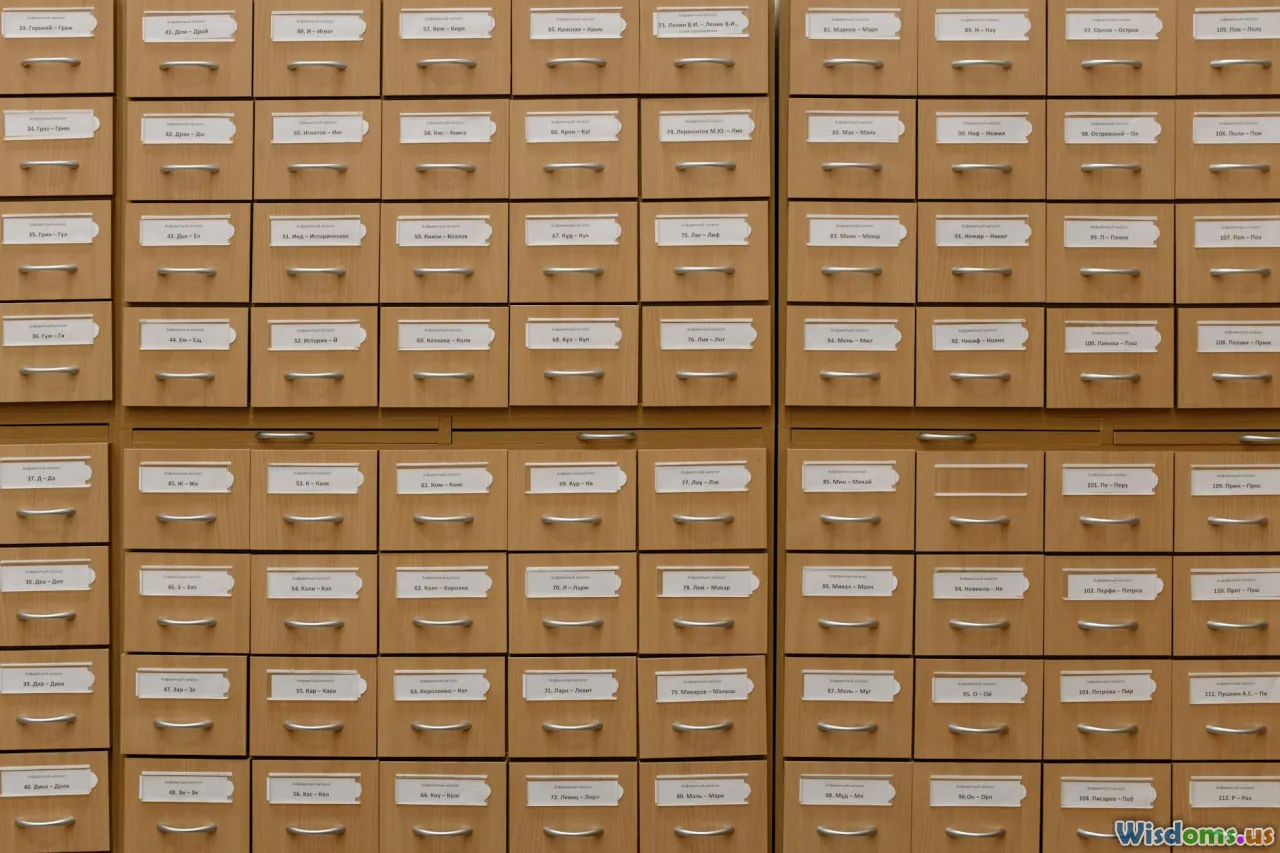
Some organizing tricks feel like magic until they don’t. Color coding is one of those. A row of perfectly tagged folders, a rainbow of sticky notes, a calendar that blossoms with distinct hues—these visuals invite calm and promise clarity. But is color coding really the best organizing trick ever, or is it just the most photogenic? The honest answer is nuanced: color is a powerful tool, but its power depends on how (and where) you use it. If you treat color like a system instead of a decoration, it can cut search time, reduce errors, and make information pop at a glance. If you treat it like confetti, it backfires.
This article dives deep into the psychology, strategy, and practical implementation of color coding—plus when to skip it and what to use instead. You’ll get step-by-step methods, real-world examples, pitfalls to avoid, and a simple way to test if color is actually helping you.
The Psychology of Color: Why It Works (and When It Doesn’t)

Color is not just pretty—it’s cognitively efficient. Our visual system can detect differences in hue and saturation extremely quickly, sometimes before we’re consciously aware of it. That’s why a red folder stands out in a sea of beige ones and why a single green dot on a screen catches your eye immediately.
Key psychological reasons color coding can work:
- Pre-attentive processing: Certain visual properties—like color—are processed in milliseconds, allowing rapid “pop-out” effects. This is why finding the blue item among the gray ones feels almost instant.
- Attention guidance: Distinct colors can steer your eyes to what matters, reducing the time you spend scanning cluttered information.
- Memory cues: When used consistently, color becomes a mental shorthand. Think of how you instinctively associate red with stop or danger, or blue with links. Color can act as a retrieval cue for long-term memory.
- Chunking: Colors help group related items, reducing cognitive load by chunking information.
But color has constraints you can’t ignore:
- Color vision deficiencies: Roughly 8% of men and about 0.5% of women have some form of color vision deficiency, most commonly red-green. If your entire system hinges on distinguishing red from green, you’re excluding a significant portion of people—or future you, under poor lighting.
- Context sensitivity: Colors mean different things culturally. White can symbolize purity in one culture and mourning in another. Red can mean danger or celebration depending on context.
- Saturation fatigue: Too many saturated colors create visual noise. Overly bright palettes may cause strain and reduced readability.
- Environment constraints: Low light, grayscale printing, and cheap monitors can neutralize your carefully chosen palette.
Verdict: Color can be a top-tier organizing tool because it’s fast and intuitive—but only when it’s used in alignment with how human vision and memory actually work.
Where Color Coding Truly Shines

Color coding excels in domains where quick categorization, repeat recognition, and spatial patterning combine. Here are use cases where color coding often pays off immediately:
-
Calendars and schedules:
- Assign colors by area of life: blue for deep work, orange for meetings, green for personal, purple for learning.
- Benefits: One glance conveys balance (too much orange means meeting overload) and quicker mental context-switching.
- Example: A product manager colors customer interviews yellow and internal reviews teal. This reduces “what is this?” moments when scanning the week.
-
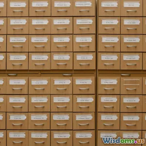
Filing and archives:
- Use color as a zone marker: finance (navy), legal (burgundy), operations (forest), marketing (cyan), HR (magenta).
- Benefits: Faster retrieval in physical spaces. Color tabs let you navigate drawers like a map.
-
Cables and equipment:
- Use colored cable ties or heat-shrink tubing: blue for network, red for power, yellow for peripherals, green for audio.
- Benefits: Troubleshooting becomes faster and safer. There’s less unplugging the wrong thing.
-
Inventory and storage bins:
- Warehouse or home storage can use color to indicate status or category: red = needs inspection, green = ready for dispatch, gray = on hold.
- Benefits: At-a-glance workflow management without reading labels on every bin.
-
Project boards and kanban:
- Color labels by type of task: bug (red), feature (blue), technical debt (brown), research (purple), design (pink).
- Benefits: A quick color distribution tells you if you’re firefighting (too much red) or innovating (more blue/purple).
-
Safety and operations:
- Many industries already rely on color conventions: safety signage, lab hazard labels, wiring standards, and status lights.
- Benefits: Fewer mistakes in high-stakes contexts. Color reduces the time to decide and act.
Patterns emerge: color helps when you’re triaging, sorting, or scanning—especially in stable systems where categories don’t change every week.
Where Color Coding Fails You (And What To Do Instead)

Color coding fails when it stands alone, when it’s overused, or when it’s misapplied to the wrong kind of information. Watch for these traps:
-
Too many categories:
- If you need 15 distinct colors, your brain won’t keep up. Most people comfortably discriminate 5–7 categories at a glance.
- Fix: Limit your palette. Group smaller subcategories under a shared color and differentiate subcategories with icons or text.
-
High turnover categories:
- If labels change frequently, the color memory you build never stabilizes.
- Fix: Use neutral base colors and emphasize text labels, grouping, or numbering systems.
-
Red-green collisions:
- Red and green are the most common confusion point for color vision deficiency.
- Fix: Avoid using red/green as the sole signal. Pair red with a triangle icon and green with a circle; use contrasting patterns.
-
Grayscale failure:
- If your document is printed in black and white, your meaning vaporizes.
- Fix: Layer color with shapes, line styles (solid vs dashed), and clear labels.
-
Aesthetic over function:
- A rainbow planner looks cool but can become a Where’s Waldo page.
- Fix: Favor contrast and legibility. Reserve saturated colors for highlights, not base layers.
-
Misfit for the task:
- Color is great for category recognition, not for conveying sequence, magnitude, or exact priority.
- Fix: Use numbers for strict priority (P1, P2), progress bars for magnitude, and timelines for sequence.
When you sense confusion, slow down and ask: What job am I hiring color to do here? If the job is better served by hierarchy, layout, or numbering, use those instead—or in addition.
Design a Color Code That Survives Real Life: A Step-by-Step Plan

You don’t need to be a designer to build a robust color system. Use this practical sequence.
- Define the decisions color should speed up
- Write 1–3 specific questions color will answer at a glance, such as:
- Which documents are finance-related?
- Which calendar items require deep focus vs light admin?
- Which issues are bugs vs features vs chores?
- Cap the number of categories
- Aim for 4–7 top-level colors. If you need more detail, nest sub-labels inside text, icons, or patterns.
- Choose an accessible palette
- Prefer high-contrast, color-blind-friendly combinations. A starter six-color set:
- Blue #1f77b4
- Orange #ff7f0e
- Green #2ca02c
- Purple #9467bd
- Brown #8c564b
- Pink #e377c2
- These colors differ in hue and luminance sufficiently to survive many contexts.
- Map colors to categories by meaning, not whim
- Leverage common associations when they help:
- Red or orange for blockers, risk, or urgent issues.
- Green for ready/complete.
- Blue for information or planning.
- Purple for strategy or research.
- If a category breaks convention, ensure the legend is highly visible.
- Add redundancy so color isn’t the only clue
- Pair each color with a symbol or shape:
- Red = ▲ (triangle)
- Green = ● (circle)
- Blue = ■ (square)
- Purple = ◆ (diamond)
- Also include 2–3 character text labels: BG, FT, TD for bug/feature/tech debt.
- Stress-test in bad conditions
- Print in grayscale. Can you still tell categories apart via shapes and labels?
- View on a low-brightness phone screen.
- Show to a colleague with color vision deficiency or use a simulator.
- Document the legend and freeze it for a period
- Create a simple legend card and pin it near your workspace or at the top of your digital board.
- Lock the system for 30 days. Don’t change colors mid-flight; habits need time.
- Train your eye with consistent placement
- Put the color indicator in a consistent spot: left edge of a file label, top-right corner of a sticky note, first label on digital cards.
In short: Decide, limit, choose smartly, layer cues, test, and freeze. That sequence saves you from the two biggest risks—overwhelm and drift.
Digital vs Physical: Same Idea, Different Tactics

Color coding lives in both worlds, but the tactics differ.
Digital tactics:
-
Calendar categories:
- Color whole calendars (Work vs Personal) rather than individual events to reduce micro-decisions.
- Use lighter shades for tentative events and saturated ones for confirmed events.
- Add an emoji icon in the event title to reinforce meaning.
-
Boards and lists (Trello, Asana, Jira, Notion):
- Limit to 5–6 label colors. Map each to a short code in the title.
- Automate with rules: if label = Bug, then due date = +2 days and assign to QA lead.
-
Dashboards and spreadsheets:
- Use conditional formatting sparingly. Make red for outliers only, not for every low-value metric.
- Always include a textual threshold (e.g., < 95%) next to the colored cell.
-
Data visualization:
- Avoid rainbow gradients for continuous data. Use a single-hue gradient or a diverging palette.
- Ensure lines differ by both color and style (solid vs dashed) in charts.
Physical tactics:
-
Folders, binders, and tabs:
- Choose durable tabs in your 5–7 chosen colors. Keep spare tabs in a “maintenance” envelope.
- Print the legend on the first page of each binder.
-
Labels and tapes:
- Use colored washi tape or label tape along the spine, but keep the text high-contrast black.
- For cables, use zip ties or heat-shrink tubing, paired with a numeric tag.
-
Sticky notes:
- Reserve a single color for urgent items and another for ideas. Avoid the rainbow explosion.
- Write large, bold headings on sticky notes; color is not a substitute for legibility.
-
Whiteboards and walls:
- Assign marker colors for roles or categories. Photograph the legend in the corner.
- Use magnet dots with paired patterns for color-blind accessibility.
Across both worlds, the rule is the same: color is a highlight, not a crutch. Always pair color with another cue.
Domain Playbooks: Plug-and-Play Color Systems

If you want a jumpstart, use one of these domain-specific templates.
Home office:
- Categories and colors:
- Finance (navy), Legal (burgundy), Taxes (green), Home Maintenance (orange), Health (teal), Personal Projects (purple)
- Implementation:
- Binders with matching spine tape and a printed legend.
- A small box with colored file folders. The top tab always shows the color bar plus a two-letter code (e.g., TX for Taxes).
- Receipts drop zone: Green folder for deductible items, orange for reimbursable.
- Tip: Keep a “neutral” gray for one-off or temporary items.
Team projects:
- Categories and colors:
- Bug (red), Feature (blue), Tech Debt (brown), Research (purple), Design (pink), Ops (green)
- Implementation:
- In your task tool, assign these labels and create a saved view for each.
- Automations: Red label triggers Slack alert; brown triggers a weekly reminder.
- Weekly report screenshot uses the same colors in charts.
- Tip: Put color codes in onboarding docs so new members adopt the system quickly.
Classrooms:
- Categories and colors:
- Homework (blue), Tests (red), Reading (green), Projects (purple), Announcements (orange)
- Implementation:
- Handouts with a colored stripe at the top and a matching icon.
- Classroom bins aligned with the color scheme for turn-in.
- For digital assignments, add the same colored tags in the LMS.
- Tip: Provide a black-and-white-friendly version with shapes and bold headings.
Research and labs:
- Categories and colors:
- Chemical hazard levels (use mandated standards), Equipment status (green ready, yellow calibration due, red out of service), Data types (blue measurement, orange simulation, purple analysis)
- Implementation:
- Equipment tags with both color and QR code linking to maintenance logs.
- Lab notebooks with colored edge tabs and a legend on the inside cover.
- Freezer boxes with colored stickers indicating sample type and date band.
- Tip: Align with regulatory color standards; never invent your own for safety-critical signals.
Measure If It’s Working: A 14-Day Experiment

Don’t guess—measure. Here’s a simple test to see whether your color coding actually helps.
Before you start (Day 0):
- Choose two common tasks where color coding should help:
- Finding a document within your files
- Triaging tasks on your board
- Establish baseline metrics:
- Search time: How long to find a target item (average of 5 trials)?
- Error rate: How often you pick the wrong item first?
- Cognitive ease: Quick 1–5 rating of how mentally “heavy” the task feels.
Design and apply your color system (Days 1–2):
- Build the legend, limit to 5–7 colors, add redundancy.
- Apply the system consistently to a subset of your items.
Use it normally (Days 3–13):
- Don’t tweak daily. Let your brain adapt.
- Keep notes when things feel confusing.
Re-measure (Day 14):
- Repeat the same trials. Compare average search time, error rate, and cognitive ease.
Interpretation:
- If search time drops by 20%+ and errors fall, color coding is paying off.
- If results are flat, consider reducing colors, improving redundancy, or switching to a different organizing method for that domain.
This tiny experiment transforms color coding from a vibe into a decision backed by data.
Advanced Tips: Palettes, Patterns, Automation, and Shared Rules
Take your color coding from good to great with these practices.
-
Palette discipline:
- Use one master palette everywhere: your calendar, labels, dashboards, and slides. This creates instant associations.
- Keep a reference card with hex codes and usage guidelines.
-
Contrast and hierarchy:
- Put color on small surfaces (bars, icons, tabs) so it functions as a highlight. Use neutral backgrounds for readability.
- Reserve very bright colors for warnings or critical items.
-
Patterns and shapes for accessibility:
- Pair every color with a distinct pattern (dots, stripes, crosshatch) or icon.
- Use consistent shape mapping: triangles for risk, circles for ready, squares for planning.
-
Automation hooks:
- If label = Red (bug), auto-assign to team lead and schedule next check-in.
- Use conditional formatting to highlight overdue items only—not to color every status.
- On a whiteboard, take a photo weekly and auto-archive to a folder named with that week’s color code for easy retrieval.
-
Versioning and governance:
- Treat your color scheme like a style guide. Document it and version it.
- Quarterly review: Which colors were overused? Which categories were ambiguous?
-
Tooling shortcuts:
- Create calendar templates with pre-colored event types.
- In design tools, save swatches and symbols for your label set.
-
Communication:
- Put the legend everywhere—footer of dashboards, top of project boards, inside binder covers.
- When you email a screenshot, include the legend as a small key.
Three Mini Case Stories

Examples help translate theory into action. Here are three composites based on common scenarios.
- The graduate student’s reading avalanche
- Problem: A grad student had 200+ PDFs across different topics and kept rereading abstracts to remember why they mattered.
- Color plan: 5 colors—blue (theory), green (methods), orange (dataset), purple (related work), red (must-cite). Each PDF got a color tag and a two-letter code in the file name.
- Result: In two weeks, retrieval time for a “must-cite methods paper” dropped from ~45 seconds to ~12 seconds on average. The student reported fewer duplicates added to the library.
- Lesson: Color + filename codes beat color alone. The file name travels even where color doesn’t.
- The product team with mounting bugs
- Problem: A mid-sized team’s kanban board had 10+ labels, many colors, and little consistency. Sprints felt chaotic.
- Color plan: Reduced to 6 labels with strong associations. Bugs (red ▲), features (blue ■), design (pink ❤), research (purple ◆), tech debt (brown ▣), ops (green ●). Automation tied red to SLA timers.
- Result: The team’s standup meetings shortened by 25% because priorities were visible at a glance. Missed SLAs decreased as the red column triggered timely reminders.
- Lesson: Fewer colors and clear icon pairings improved shared understanding.
- The clinic’s paper-digital hybrid
- Problem: A small clinic had mixed paper and electronic records; staff wasted time matching patient charts to appointment status.
- Color plan: Visit status used color tabs on paper files—green ready, yellow waiting on lab, orange needs insurance verification, red urgent. Digital schedule matched the same colors and icons.
- Result: Fewer misplaced charts; front desk triage became smoother. New staff learned the system in a day because color and icons were consistent across paper and screen.
- Lesson: Cross-medium consistency is crucial when workflows straddle analog and digital.
These stories echo a core theme: color works best when it’s simple, redundant, and relentlessly consistent.
Alternatives and Complements You Shouldn’t Ignore
Color is excellent, but it shouldn’t carry the entire burden. Layer other cues to make your system resilient.
-
Icons and shapes:
- Pair categories with icons (bug, lightbulb, wrench) or shapes (triangle, circle, square). This boosts recognition, especially in grayscale.
-
Numbering and codes:
- Use short codes like BG, FT, RD. These can be read aloud and typed.
- For priority, numbers beat color: P1, P2, P3.
-
Typographic hierarchy:
- Use bold for headings, regular for descriptions. Keep font sizes consistent.
-
Spatial grouping and layout:
- Group related items together. Place crucial elements in consistent positions.
-
Timing and sequence markers:
- Use arrows, progress bars, or checklists to convey sequence and completion.
-
Physical cues:
- Different paper sizes or textures (card stock vs standard) can signal importance.
Think of color as one rung on a ladder of clarity. The strongest systems climb multiple rungs at once.
Maintenance: Preventing Color Drift Over Time

The biggest threat to any color code is drift—when meanings creep, exceptions multiply, and colors bleed into each other. Keep it tight with light governance.
-
Freeze windows:
- Only change the palette or meanings during scheduled review periods (e.g., quarterly). Avoid ad hoc changes.
-
Legend visibility:
- The legend should be easy to find in every context—physically printed and digitally pinned.
-
Onboarding:
- New team members get a one-page color guide. Include examples of correct and incorrect use.
-
Audits:
- Monthly, sample 20 items. Check if color, icon, and text label all align. Fix drift immediately.
-
Retirement plan:
- If a color-category is rarely used or creates confusion, retire it and reassign items deliberately.
-
Backup for emergencies:
- If a color marker runs dry or a label color is out of stock, have a pattern or icon ready as the fallback so meaning doesn’t evaporate.
-
Synchronize across tools:
- If you rename or recolor a label in one tool, update the others the same day. Consistency across surfaces is non-negotiable.
Good maintenance turns a helpful system into a habit that survives busy seasons and staff changes.
So, Is Color Coding the Best Organizing Trick Ever?

Color coding is among the most effective quick-clarity tools you can use, but it is not universally best for every job. Here’s the practical verdict.
Use color coding as your primary organizing trick when:
- You’re sorting stable categories that won’t change weekly.
- Rapid scanning and triage matter more than precise sequencing.
- Multiple people need to align quickly on what’s what.
- You can add redundancy (icons, shapes, short codes) and maintain the system.
Lean on other tools instead (or alongside color) when:
- You must convey exact order, priority, or magnitude—numbers and layout are better.
- Your environment often strips color (grayscale printing, dim light) or your audience has color vision challenges.
- Your categories are too numerous or too fluid to map meaningfully to a limited palette.
If you embrace the right jobs for color, design a lean and accessible palette, and pair it with clear labels and shapes, color coding can feel like a superpower—cutting search time, reducing miscommunication, and making complex information instantly navigable. If you overload it or let it drift, the rainbow turns to fog.
The real trick isn’t the colors themselves; it’s the system behind them. Start small, measure results in two weeks, and keep only what makes decisions faster. In organizing, the best tool is the one that makes clarity effortless—and when used wisely, color coding does exactly that.
Rate the Post
User Reviews


Popular Posts


