Mistakes to Avoid in Office Interior Photography
12 min read Avoid common pitfalls in office interior photography to capture stunning, professional results with expert tips and real-world examples. (0 Reviews)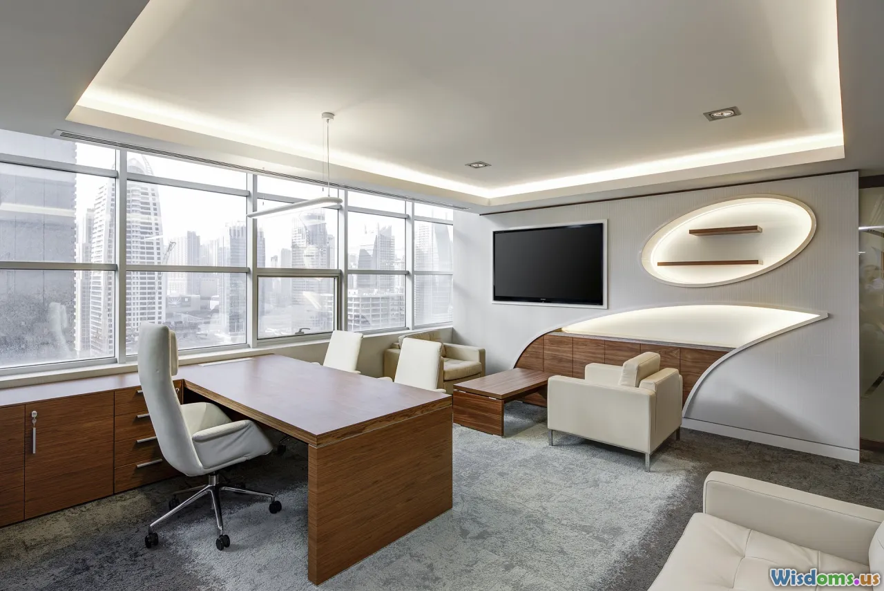
Mistakes to Avoid in Office Interior Photography
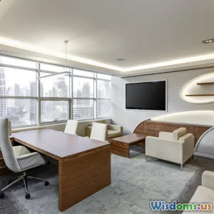
Office spaces aren’t just backdrops for business—they’re reflections of a company’s ethos, creativity, and culture. The right interior photographs can convey professionalism, beckon talent, or woo clients. Yet, getting the perfect shot isn’t as simple as clicking a button—subtle missteps can diminish even the sleekest workspaces.
Whether you're a professional photographer, a marketer, or a DIY home-stager, knowing what not to do is just as critical as mastering what works. In this guide, we’ll illuminate the common mistakes made in office interior photography and how to bypass them, illustrated with real insights, actionable advice, and field-tested techniques.
Why Every Detail Matters
Studies reveal 94% of first impressions are design-related—that extends beyond a physical space, affecting how it appears in photographs as well (Design Council, 2022). In today’s digital-first world, a company’s image travels faster than ever. Bad photographs can derail perception, undermining even high-end office investments.
From lighting mishaps and odd furniture arrangements to technical faults, avoiding these pitfalls ensures your office images truly reflect the space’s value—and your brand’s distinctiveness.
1. Ignoring Lighting: The Most Critical Element
Underestimating Natural Light
Natural light is to interior photography what seasoning is to cuisine—it elevates everything. Yet, one of the most common mistakes is neglecting to harness it effectively. Either photographers shoot at the wrong time of day when the light is harsh and blotchy, or they rely solely on inefficient artificial lighting.
Example in Practice: A tech startup commissioned photos for its new headquarters. The photographer shot at midday, facing windows directly, resulting in harsh glares, dark shadows, and washed-out colors. The captivating glass walls and open design faded into overexposed monotony.
Tip:
- Shoot during the "golden hour" (early morning or late afternoon) when daylight is diffused.
- Use curtains, blinds, or diffusion sheets to soften sunlight.
Overusing Artificial Lighting
While sometimes unavoidable, solely artificial lighting—especially fluorescent—can cast unnatural tones and create distracting hotspots or color casts.
Data Point: In a 2021 survey by Architecture Photography School, 73% of professional photographers listed "unflattering color cast from artificial light" as a top complaint in amateurs’ portfolios.
Tip:
- Supplement mixed lighting with portable soft boxes or reflectors.
- Set your camera's white balance manually based on the dominant light source.
Not Noticing Flicker or Color Shifts
LED or fluorescent tubes may cause flicker effects or subtle color shifts unnoticed by the naked eye but apparent on digital sensors. This can ruin shots and complicate post-production.
Tip:
- Disable overhead lights or switch to lighting that matches daylight temperature.
- Test shots with a color card to catch subtle shifts early.
2. Clutter and Visual Distractions: Undermining Professionalism
Leaving Personal or Irrelevant Items in the Frame
A desk covered in coffee cups, cables, and personal effects might show workplace reality—but it doesn’t convey an organized, professional environment. Such distractions pull the viewer’s attention from the architecture and design of the office, muddying the company’s message.
Real-World Example: A financial services firm attempted to save costs by DIY-ing their photo shoot, overlooking half-filled coffee mugs and post-it reminders clinging to monitors. The resulting images looked frenetic and unprofessional when published on their website.
Tip:
- Do a thorough walkthrough to clear away loose papers, personal paraphernalia, and trash before each photo session.
Overdecorating or “Staging” Unnaturally
Some confuse ‘staging’ with adding excess—too many plants, promotional materials, or ornate elements—which detract from clean design lines.
Tip:
- Aim for balance: sparing, thoughtful staging enhances space while allowing architecture/furniture to shine.
- Review test shots; edit décor as needed.
3. Poor Composition and Framing: Losing the Story
Not Using Leading Lines or Geometry
Office interiors offer abundant lines—windows, furniture, carpets, and ceiling panels—that naturally lead the eye. Not leveraging these can create lifeless, confusing images.
Quote:
"In interiors, composition is about storytelling—lines and angles guide your viewer through that narrative." – Sarah Jacobs, Commercial Interiors Photographer
Tip:
- Use hallways, desks, or architectural thresholds to lead the viewer’s eye.
- Apply the rule of thirds and watch for key anchoring points in every frame.
Crooked Horizons and Distorted Angles
Lens distortion or tilting the camera can skew lines, making desks slope and windows tilt awkwardly—creating subconscious unease.
Data:
- Horizontal misalignment is one of the first things viewers notice; studies show it reduces trust in marketing materials by up to 17% (Visual Literacy Journal, 2020).
Tip:
- Use a tripod and spirit level for precise alignment.
- Employ software correction judiciously; avoid over-correcting which can introduce other artifacts.
Shooting from Eye-Level Only
Shooting everything from the standing eye-level can quickly flatten spaces.
Tip:
- Take some shots from lower angles, just above desk height, or even overhead. Rooms appear larger, furnishings become more prominent, and architecture gains depth.
- Experiment with varied perspectives but avoid gimmicks—ground the shot in the reality of how a person would use the space.
4. Leaving Technical Fundamentals Behind
Using Wrong or Inadequate Equipment
While top-tier equipment isn't everything, certain mistakes stem from using unsuitable gear: wide-angle distortion, insufficient depth of field, or poor optics are common issues.
Example: Smartphones or kit lenses might suffice for quick snaps, but ultra-wide phone lenses typically introduce heavy distortion and color aberrations. For professional work, these faults are non-negotiable.
Tip:
- Use a full-frame camera with a tilt-shift lens for critical architecture shots.
- A sturdy tripod is essential for steady, bracketed exposures.
Skipping Image Bracketing or HDR
Offices often feature extreme dynamic ranges: bright windows beside shadowed corners. Failing to bracket exposures means losing texture in the highlights or missing important shadow details.
Tip:
- Capture multiple exposures (bracketing) and blend for balanced results.
- Use HDR carefully—naturalistic tonality is crucial; over-processed images look fake and detract from credibility.
Overlooking Color Correction
Professional office photographs must deliver accurate yet vibrant color. Neglecting calibration at any stage—monitor, camera, or lighting—skews brand colors, misrepresents decor, and reduces impact.
Tip:
- Calibrate monitors monthly.
- Shoot RAW and use color profiles for consistency during editing.
5. Not Preparing or Communicating with Stakeholders
Skipping the Walkthrough
Neglecting a pre-shoot walkthrough with office managers leads to surprises: locked rooms, ongoing construction, or areas in disarray.
Tip:
- Schedule a pre-shoot meeting to review every intended shot location.
- Use a checklist confirming access, setup needs, and special requests.
Not Anticipating Human Factors
If people are meant to be in shots (to show scale, collaboration, or diversity), failing to prepare them visually—clothing, placement, activity—results in awkward, staged, or noncompliant shots (e.g., unapproved employee photos).
Tip:
- If including staff, brief them on dress code and poses consistent with company culture.
- Secure proper permissions and model releases upfront.
6. Overediting or Heavy-Handed Post-Processing
Excessive Filters, HDR, or Over-Sharpening
Current software can transform mundane images, but over-processed photos look unnatural and dated. Offices should feel bright, real, and inviting—not cartoonish.
Example: One multinational corporation overzealously saturated their branded colors in photos. The result? Unnatural, eye-straining images that drove down website engagement (web analytics confirmed a 20% drop in time-on-page for their interior gallery).
Tip:
- Prioritize subtle enhancements: mild contrast, correcting perspective or verticals, gentle color balancing.
- Retouch only as much as necessary to preserve textures and authenticity.
Neglecting Consistency Across Image Sets
Inconsistent color tones, exposure, or style between photos can make company image galleries look uncoordinated. This undermines brand identity and confuses viewers.
Tip:
- Apply a standard editing workflow—presets or global adjustments—across the entire set.
- Double-check galleries for cohesiveness before publishing.
7. Forgetting the End-Use or Context
Ignoring the Final Platform: Print vs. Digital
High-res shots for print need finer details than standard web images. Conversely, ultra-large files bog down load times for mobile viewers.
Tip:
- Export final images in the necessary resolutions for each platform—print, web, mobile, or email.
Cropping Without Intent
Leaving crucial design elements out of frame (e.g., important signage, branded details), or improper aspect ratios that stretch or squeeze photos, can diminish a space’s effect.
Tip:
- Plan compositions for the intended aspect ratio and platform.
- When in doubt, leave negative space for potential text overlays (e.g., in brochures, banners).
Conclusion: From Mistakes to Mastery
Capturing office interiors is not just “taking photos”—it’s a strategic act of visual storytelling. The best images amplify space, reinforce brand, and transcend mere documentation. But they’re only possible when pitfalls are avoided.
Remember: Light is your best friend, and clutter your unseen enemy. Composition reveals narrative; gear and editing refine, but do not replace, creative vigilance. Above all, clear communication—with both the space and its stakeholders—ensures your images serve their business purpose.
Through purposeful preparation, technical mastery, and a discerning eye, any office can become a showcase for innovation, culture, and excellence. Stand out by steering clear of common mistakes—and let every image speak with confidence and clarity.
Ready to improve your office photography? Start with stripping away distractions, understanding your light, and framing for story. Your next shot could define a company’s first impression.
Rate the Post
User Reviews


Popular Posts


