
Proven Strategies to Boost Retention for Visual Learners
33 min read Actionable, research-backed tactics to help visual learners remember more—from dual coding and sketchnotes to mind maps, infographics, and spaced repetition—plus classroom and workplace examples. (0 Reviews)
Proven Strategies to Boost Retention for Visual Learners
If you’ve ever recalled a concept by picturing the diagram from last Tuesday’s meeting—or remembered a historical event by seeing the timeline you sketched in your notebook—you’re tapping into the power of visual memory. Visual learners, and in truth most people under the right conditions, benefit when information is presented in a spatial, image-rich format. Cognitive scientists have repeatedly demonstrated the “picture superiority effect” (images are generally remembered better than words) and the value of “dual coding” (combining words and visuals), making visuals a practical, research-backed lever for retention.
Below, you’ll find proven, concrete strategies to design notes, lectures, study sessions, and workflows that align with how visual cognition operates. These aren’t vague tips—they’re step-by-step methods, tools, and templates you can implement this week.
Why visuals boost memory (the science that matters)

Visual learners thrive when information has a spatial or pictorial structure. But this isn’t just a preference; it’s supported by cognitive principles that benefit everyone:
- Dual coding: When you pair words with meaningful visuals (diagrams, icons, spatial layouts), you activate two memory pathways. On recall, your brain can retrieve from either stream, increasing the odds you remember. Researchers Allan Paivio and later multimedia learning experts have shown that this redundancy improves retention and transfer when visuals directly support the text, not when they’re merely decorative.
- Picture superiority: Images are generally more memorable than words alone, as long as they’re relevant and interpretable. This helps visual learners anchor complex ideas to concrete visual cues.
- Spatial memory: The human brain encodes location exceptionally well. That’s why methods like the memory palace (method of loci) work—ideas “attached” to locations or arrangements are easier to retrieve.
- Cognitive load and signaling: When visuals reduce extraneous processing—e.g., a flow diagram that removes irrelevant detail and highlights what matters—learning improves. Effective visuals guide attention (signaling), segment information, and reduce the need to hold everything in working memory at once.
Takeaway: The right visual at the right time is not “fluff.” It is an efficiency gain for memory.
Choose the right visual for the job

Not all visuals improve retention. The key is fit-for-purpose design:
- Relationships (cause-effect, hierarchy): Use node-link diagrams, fishbone (Ishikawa) diagrams, or tree maps. Example: Showing how cytokines influence immune responses works better with a branching diagram than a paragraph.
- Processes and sequences: Use flowcharts, timelines, or swimlanes. Example: A customer onboarding journey becomes tangible in a swimlane showing marketing, sales, and success handoffs.
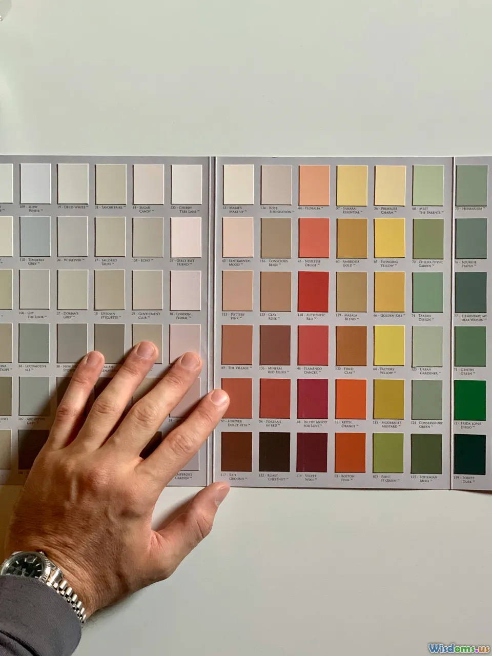
- Comparisons: Use tables, side-by-side cards, or bar charts. Example: Comparing three project management tools? A matrix with must-have features reduces cognitive load versus prose.
- Parts and structure: Use labeled diagrams or exploded views. Example: Anatomy retention improves when students annotate a blank skeletal diagram from memory.
- Quantitative insight: Use dot plots, unit charts, or slope graphs rather than 3D pie charts. Example: Show change-over-time with a slope graph to instantly reveal trend direction and magnitude.
Pro tip: Before you make a visual, write a single sentence stating its job (e.g., “Show how feedback moves from customers to engineering”). If you can’t, your visual will likely bloat.
Build a personal visual note-taking system
A consistent system beats a stack of pretty pages. Here’s a repeatable framework:
- Page layout: Divide the page into zones—title (top), main ideas (left), examples (right), summary or next actions (bottom). Draw faint guidelines or use a printable template.
- Icon library: Pre-create 30–50 reusable icons (e.g., lightning bolt for insight, chain link for connection, compass for strategy). Practice drawing each in under five seconds. Store them on the inside cover.
- Connectors: Use arrows (cause), dotted lines (related), brackets (group), and numbers (sequence). Keep a legend on page one.
- Color discipline: 3-color rule—blue for headings, black/gray for body, a single accent (e.g., orange) for highlights. This prevents confetti pages that mask hierarchy.
- Marginalia: Reserve a 1.5-inch margin for visual cues—callouts, small graphs, mini timelines. This becomes your “recall runway” when reviewing.
Example: In a lecture on neural networks, place the high-level architecture on the left (input → hidden → output), examples of activations or loss curves on the right, and a one-sentence takeaway at the bottom (“Regularization reduces overfitting by penalizing complexity”).
Turn paragraphs into concept maps

Concept maps transform opaque text into a network you can see. Try this 5-step method:
- Extract nouns and verbs from a paragraph. Nouns become nodes; verbs become relationships.
- Place the key concept in the center.
- Surround it with secondary nodes, spacing by importance.
- Draw arrows with labeled relationships (e.g., “leads to,” “requires,” “inhibits”).
- Add examples or boundary conditions as edge notes.
Example: From a biology paragraph about homeostasis, you might map “Homeostasis” at center, linked to “Temperature regulation,” “Blood glucose,” “Negative feedback,” “Effectors.” Arrows: “Negative feedback” → “stabilizes” → “Homeostasis.” Then attach “Sweating,” “Insulin release” as concrete examples.
Review routine: Cover the labels, try to verbalize relationships, then uncover to check accuracy. Convert confusing links into icons next time (e.g., a thermostat for negative feedback).
Make sequences stick with timelines and flows

Sequenced information is prime territory for visuals:
- Story timelines: For history or case studies, draw a horizontal line with consistent spacing. Above the line: key events; below the line: consequences. Use small icons (gavel for policy, factory for industry).
- Process flowcharts: Use consistent shapes—rectangles (steps), diamonds (decisions), rounded rectangles (start/end). Limit each step to 4–7 words.
- Swimlane diagrams: Assign each lane to a role (e.g., student, instructor, admin). This clarifies handoffs, reducing ambiguity.
Example: Document a hiring process in a swimlane: candidate applies → recruiter screens → hiring manager interview → panel → offer. Add SLA notes (e.g., “48 hours” above the recruiter screen) as small badges.
Memory trick: During review, redraw the entire process from memory in under two minutes. Speed forces you to recall structure, not just wording.
Apply dual coding without overdecorating

Dual coding works best when visuals and text serve the same message:
- Pair each paragraph with a simple, non-decorative visual: a sketch, diagram, or layout that directly represents the core idea.
- Use annotation: arrows, underlines, and labels that direct attention to the relevant part of the visual.
- Reduce split attention: Put the label near the feature; don’t make the eye travel across the page for the legend.
- Avoid seductive details: Beautiful but irrelevant images hurt retention. If you love them, place them after the learning task as a reward, not during.
Example: Teaching photosynthesis? On the left, a diagram of chloroplasts with arrows showing energy flow and labeled “light-dependent reactions” vs. “Calvin cycle.” On the right, 2–3 bullet lines per label. Keep both in one integrated panel.
Design for cognitive load: layout, chunking, and signaling

Reduce mental effort by designing structure that learners can see:
- One idea per slide or section: If you can’t title it succinctly, split it.
- Chunking: Group related items into 3–5 chunks. Use boxes or background tinting to show clusters.
- Signaling: Bold key words, use arrows to show flow, and place a simple progress bar at the top (Step 2 of 5) to orient the learner.
- Whitespace and alignment: Leave breathing room; align elements to a grid to imply order.
Example: A project kickoff deck with five sections, each color-coded lightly and introduced by a breadcrumb (Discovery → Scope → Risks → Timeline → Next steps). Use the same location for key takeaways on every slide.
Use color to code meaning (without causing chaos)
Color can guide or mislead. Make it do the former:
- Define your palette: 1–2 neutrals (black, gray), 1 primary accent (blue/green), 1 warning color (red/orange). Keep saturation moderate.
- Consistent meaning: Blue always equals “input,” green “output,” red “caution,” etc. Document your legend.
- Accessibility: Check contrast (aim for WCAG AA or better) and avoid red–green pairings alone. Use shape plus color for critical distinctions.
- Highlight sparingly: Reserve your accent color for the 10–20% of content that matters most.
Example: In a concept map, use green nodes for causes, blue for processes, gray for context, and red for constraints. Keep labels black for maximum legibility.
Harness spatial memory with the method of loci

Transform abstract lists into a route you can mentally walk:
- Pick a familiar place (your home, a favorite coffee shop). Identify 10–15 distinct locations in order.
- Convert each item into a striking, odd image.
- Place each image at a location and mentally rehearse walking the path.
- For review, “walk” the route and retrieve each item.
Example: Memorizing the five stages of design thinking (Empathize, Define, Ideate, Prototype, Test). At your front door, empathize: a giant ear listening. In the kitchen, define: a thick dictionary. On the dining table, ideate: lightbulbs floating. In the garage, prototype: a cardboard model. In the driveway, test: a crash-test dummy.
Upgrade: Use a whiteboard sketch of your route with tiny icons at each spot for initial encoding. Then remove the sketch and rely on mental imagery.
Make retrieval visual: test yourself with drawings

Retrieval practice cements memory. Visual learners can make it more effective:
- Blank-a-graphic: Cover labels on a diagram and attempt to fill them from memory. Flip to check.
- Two-minute redraw: Set a timer and re-sketch the key diagram from scratch—no notes. Add missing pieces in a contrasting color after time expires.
- Diagram-first flashcards: Front side is the unlabeled visual; back side has the labels and a one-sentence explanation.
- Self-explanation arrows: While redrawing, add arrows and quick phrases explaining why connections exist. Explanation deepens encoding.
Example: In finance, practice redrawing the DuPont analysis diagram from memory (ROE broken into profit margin, asset turnover, and financial leverage), labeling each formula leg.
Spacing and interleaving—visual edition

Spaced repetition and interleaving are proven to improve retention. Modify them for visuals:
- Leitner boxes for diagrams: Create decks of diagram cards (e.g., anatomy structures, process flows). Move cards you recalled correctly to longer-interval boxes.
- Visual calendar: Place a small icon next to each day’s review set (e.g., “green dot” for biology diagrams, “gear” for process flows). The icon prompts faster setup and reduces procrastination.
- Interleave by representation: Rotate among types—mind map on Monday, timeline on Wednesday, flowchart Friday—rather than staying in one format. This discourages superficial patterning.
Example schedule: Week 1—mind map enzymes (Mon), redraw metabolic pathways (Wed), concept map inhibitors (Fri). Week 2—retest mind map (Mon), timeline glycolysis steps (Wed), retrieval practice with flashcards (Fri).
Build a domain-specific icon and metaphor bank
Your icons and metaphors should fit the subject matter. Build them progressively:
- 100-icon challenge: Over two weeks, sketch five icons per day relevant to your field (e.g., cloud, user, API, latency for software). Keep them on a single reference sheet.
- Metaphor list: For recurring themes, pick consistent metaphors. Example: Security as a lock/shield; scalability as stacked boxes; feedback as a boomerang.
- Part-whole symbols: Draw container shapes (folders, boxes) and unit shapes (dots, bricks) to depict aggregation and composition.
Example: In medical study, create icons for “infection” (spiky blob), “inflammation” (red flame), “autoimmunity” (self-arrow). Use the same icons across notes and slides so your brain immediately recognizes the pattern.
Visual templates that accelerate learning

Create reusable canvases:
- Cause–Effect Canvas: Left column “Causes,” center “Mechanism,” right “Effects,” bottom “Interventions.”
- Compare–Contrast Grid: Rows as options; columns as criteria (cost, time, risk). Add a row for “deal-breakers.”
- Project One-Pager: Title, objective, constraints, three milestones, risks with owners, and a mini timeline.
- Decision Record: Context, options sketched, pros/cons, decision, date, and a “revisit on” reminder.
Print or keep as digital templates. The structure itself becomes a retrieval cue.
Data visuals that stick: choose clarity over flair

For numbers, retention comes from seeing the story:
- Use dot plots and bar charts over pies for comparisons.
- Avoid 3D effects and heavy gradients—they distort perception.
- Label directly. If you need a legend, integrate it near the marks.
- Show change: Small multiples (same chart repeated for different categories) aid comparison.
- Annotate the key insight: A short sentence above the region of interest ensures the “so what” is unforgettable.
Example: Instead of a pie chart showing market share, use a stacked bar sorted by share with a note: “Two firms account for 72% of the market; fragmentation follows a long tail.”
Slide and whiteboard design for visual learners

In teaching and meetings, visual design can make or break retention:
- Slide rule of three: Title states the claim, middle holds the evidence visual, bottom has the implication.
- Whiteboard scaffolding: Draw the frame first—title at top-left, two columns, and a summary box bottom-right. Fill in content as you speak so the audience watches the structure grow.
- Portable legends: If you use special symbols, draw a tiny legend in the same spot on every slide.
- Minimalist motion: Animate only what changes conceptually (e.g., add one node at a time), not for entertainment.
Example: In a workshop on customer journeys, draw a large arc across the whiteboard. Mark stages (Awareness → Consideration → Purchase → Retention). Use emoji-like faces under each stage to indicate sentiment. Ask the group to add sticky notes for pain points; cluster by color.
Tools and workflows that support visual retention

Pick tools that make visuals fast to create and easy to review:
- Handwriting tablets (GoodNotes, Notability) for sketchnotes and quick diagramming.
- Diagramming tools (Excalidraw, Miro, Figma) for collaborative maps and flows.
- Knowledge bases (Obsidian, Notion) for linking visuals to notes; embed images near the relevant text block.
- Spaced-repetition apps (Anki) with image occlusion for label-the-diagram practice.
Workflow example:
- Capture: During class/meeting, sketch in GoodNotes using a 3-color scheme.
- Refine: Afterward, move the top three diagrams into Excalidraw for clean versions.
- Connect: Paste exports into Obsidian notes, link them to key concepts via tags (e.g., #diagram #mechanism #example).
- Review: Create Anki cards with image occlusion from the diagrams. Schedule 10-minute reviews.
Pro tip: Use a consistent file naming convention: YYYY-MM-DD_topic_visual-type (e.g., 2025-02-10_photosynthesis_flow). Your future self will thank you.
Set up a visual learning environment
Physical context matters:
- Vertical surfaces: Use a whiteboard wall or large poster board. The act of standing and drawing engages different motor cues and scale, enhancing memory.
- Gallery method: Pin up key diagrams around your workspace. Do a weekly “gallery walk,” explaining each aloud.
- Clear the noise: Visually busy environments drain attention. Keep your main workspace uncluttered—store reference materials on side walls.
- Light and contrast: Good overhead lighting and a matte surface prevent glare that reduces legibility.
Example: Convert a closet door into a Kanban of study topics (To Learn, Learning, Learned). Move visual cards across columns. Each move offers a small dopamine hit that sustains momentum.
Collaborate visually to teach and test understanding

Explaining visually is a high-yield test of understanding:
- Teach-backs: Pair up. One person explains the concept using a diagram while the other notes gaps. Switch roles.
- Asynchronous walkthroughs: Record a 3-minute screencast drawing and narrating the concept. Share with peers for comments.
- Collaborative boards: In Miro or a physical room, give each person a color. Co-create a concept map; color tracks authorship.
- Visual critique: Use a checklist—Is the purpose clear? Are relationships labeled? Is color consistent? What is the headline takeaway?
Example: In a nursing cohort, teams create patient-pathway flowcharts. Each team critiques another’s chart, focusing on missing decision points (e.g., vital sign thresholds).
Sector-specific playbooks

Different fields invite different visual strategies:
- STEM: Free-body diagrams in physics; reaction mechanisms in chemistry with curved arrows; circuit schematics with color-coded signals. Use redraw-from-memory drills to reinforce.
- Language learning: Pair new vocabulary with vivid images and a sketch of context (e.g., draw “market” with stalls and haggling). Create mini comics for verb conjugations.
- Medicine: Label anatomical structures on blank diagrams; pathophysiology as causal chains (infection → inflammation → symptom). Build case trees to decide differential diagnoses.
- Business: Process maps for operations; stakeholder maps for strategy; dashboard mockups for KPIs. Annotate assumptions directly on the visuals.
Example: For product managers, create a triad diagram—User Value, Business Viability, Technical Feasibility. Under each, sketch example constraints (e.g., compliance under Viability) and tag real tickets that map to them.
Measure what works: a simple retention dashboard

You can’t improve what you don’t measure. Track:
- Recall rate: Percentage of labels you fill correctly on a blank diagram.
- Redraw time: Minutes to recreate the main visual from memory.
- Error types: Missing nodes, mislabeled links, incorrect sequence.
- Review spacing: Days between reviews; correlate with recall.
- Transfer tests: Can you apply the visual to a new problem?
Create a weekly scorecard:
- Monday: Baseline redraw (time + accuracy).
- Wednesday: Spaced review test (use a new blank sheet).
- Friday: Application exercise (new case), rated 1–5 for clarity and correctness.
Use a simple rule: If recall is below 80%, shorten the spacing; if above 95%, lengthen it.
Turn reading into visuals in 15 minutes

A quick conversion routine for dense articles or chapters:
- Skim for structure: Identify headings and topic sentences.
- Extract 5–7 key ideas; write each as a short phrase.
- Decide visual type (flow, map, timeline) based on relationships among ideas.
- Sketch a rough layout—no art, just boxes and arrows.
- Add one example per major node.
- Write a headline takeaway at the top.
Example: Reading on supply chain risk? Build a hub-and-spoke map with Supplier, Logistics, Demand, Compliance. Under each, add a risk icon and a mitigation mini-note. This becomes your study or briefing artifact.
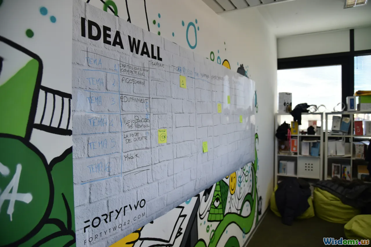
Retention-friendly meeting notes

Stop capturing transcripts. Capture structure:
- Agenda-as-map: Before the meeting starts, draw a map with each agenda item as a branch. Fill notes near each node.
- Decision diamonds: Draw a diamond next to decisions. Add criteria in small circles.
- Action lanes: Bottom of page has owners and deadlines in a horizontal lane.
- After-meeting synthesis: Spend five minutes redrawing the meeting’s “one big diagram” (e.g., a workflow change). Share that, not the raw notes.
Outcome: Teammates recall decisions more reliably; handoffs improve because roles and timing were visually explicit.
Avoid common pitfalls and myths

- The “learning styles” trap: Preferences exist, but research does not support teaching exclusively to a style. Use visuals as part of a multimodal approach—paired with practice and feedback.
- Decorative overload: Beautiful illustrations that don’t explain the concept add cognitive load. Ask: If I removed this visual, would understanding change?
- Color as crutch: Don’t rely on color alone to convey meaning. Use shape, position, and labels.
- Perfectionism: Rough visuals work. Speed and clarity beat polish for learning.
- One-format thinking: If everything is a mind map, some content will be misfit. Let the relationships drive the format.
A 7-day sprint to become a visual retention pro

Day 1: Build your 3-color palette, choose two diagram types you’ll use most (e.g., concept maps, timelines), and create a small icon bank of 20 symbols.
Day 2: Convert two dense paragraphs from a current course or project into a concept map. Practice a two-minute redraw for each.
Day 3: Take your last meeting’s notes and reframe them as a single workflow diagram. Identify one bottleneck and propose a fix.
Day 4: Set up Anki with 10 image-occlusion cards from your diagrams. Do your first spaced session.
Day 5: Teach a peer one concept using a whiteboard. Record a three-minute walkthrough. Review it and note where your visual stalled.
Day 6: Build a small visual template pack: Compare–Contrast grid, Cause–Effect canvas, and a Project One-Pager. Use them once each.
Day 7: Run your retention dashboard: measure redraw time and label recall. Adjust spacing intervals based on scores. Reflect: Which visual format felt most natural? Which yielded the best recall?
Examples that show the difference
Example 1: Software architecture
- Before: A 700-word spec describing a microservice migration.
- After: A layered diagram—clients → API gateway → services → databases—with arrows labeled for data contracts and a side panel listing failure modes. Result: New engineers ramp faster; code reviews reference the diagram.
Example 2: Biology pathways
- Before: Text list of glycolysis steps.
- After: Pathway diagram showing substrates and enzymes, with energy investment vs. payoff phases highlighted in different tints. Result: Students recall where ATP is used vs. produced.
Example 3: Compliance training
- Before: Slide deck of policies.
- After: Decision tree for “Do I need approval?” plus a timeline of the approval process, with each role clearly marked. Result: Fewer errors; quicker submission cycles.
When words beat pictures—and how to blend them

- Abstract definitions: Start with concise text; add visuals to show examples and boundaries.
- Long derivations: Use text for precision, diagrams for structure (roadmap of steps) and checkpoints.
- Dense narrative: Use visuals to extract structure (timeline, cast of characters), but keep nuances in text.
Blending technique: Lead with the “visual skeleton” (map, flow) and hang detailed text off each node. This creates a layered reading path: overview first, details on demand.
Keep it honest: evidence and continuous improvement

- Evidence-informed: Principles like dual coding, spaced practice, and signaling have decades of support. Favor visuals that clarify causal mechanisms, hierarchies, or processes.
- Micro-experiments: Each week, test one variable—icon consistency vs. none; color accents vs. monochrome; interleaving formats vs. single-format—and record recall rates.
- Feedback loop: Share your visuals with a peer or mentor. Ask what they understood in five seconds. If the headline takeaway isn’t obvious, revise.
A small change in how you draw or arrange information can produce an outsized change in what you remember. When your notes, slides, and study sessions become legible at a glance—with purpose-driven visuals, consistent symbols, and deliberate practice—retention stops being a guessing game and starts becoming a system you can trust.
Rate the Post
User Reviews
Other posts in Learning Styles & Approaches


Popular Posts


