Inclusive Design Mistakes to Avoid in Public Buildings
13 min read Essential guidance on avoiding common inclusive design mistakes in public buildings to create truly accessible, welcoming spaces for all community members. (0 Reviews)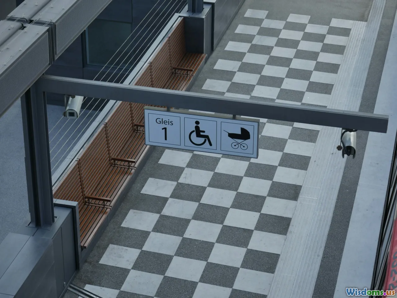
Inclusive Design Mistakes to Avoid in Public Buildings
Introduction: What Makes a Space for Everyone?
Imagine arriving at a beautiful new library, brimming with excitement for today's community event. Now, imagine being unable to climb the stairs at the entrance or struggling to interpret confusing signage. For millions, this isn't hypothetical—it's a daily reality. Public buildings, from schools and government offices to museums and parks, must serve a diverse spectrum of users. Yet, many falter at inclusivity. Inclusive design is not simply about ramps and automatic doors. It's about intent, detail, and a true commitment to making spaces accessible—no exceptions.
In this article, we’ll expose the most common inclusive design mistakes in public buildings, illuminating real-world examples, and offering clear steps to do better. Whether you’re an architect, policymaker, or an advocate, navigating these pitfalls is key to building communities that truly welcome everyone.
The High Stakes of Exclusion in Public Architecture
Poor inclusive design has consequences far beyond minor inconvenience. According to the World Health Organization, over 1 billion people live with disability globally, making up about 16% of the world’s population. Add to this older adults, parents with strollers, neurodiverse individuals, and language minorities, and it's clear that “design for all” is not a luxury—it's a necessity.
Beyond ethical considerations, there are legal implications. The Americans with Disabilities Act (ADA) in the United States, and comparable legislation worldwide, require public buildings to meet certain accessibility standards. Yet, audits and user experiences show that many spaces fall tragically short. According to a 2021 UK survey by disability equality charity Scope, 3 in 4 disabled people (76%) said they’d experienced barriers in public spaces during the previous year.
Understanding where and why inclusive design goes wrong is the first step to impactful change. Let’s dive in.
Mistake #1: Treating Accessibility as an Add-On, Not a Core Principle
Too Little, Too Late: The Problem with Retrofitting
A glaring mistake is designing a building and then tacking on accessibility features as an afterthought. This retroactive approach often results in awkward ramps at side entrances, token accessible toilets hidden at the end of a corridor, or parking only marginally close to key facilities.
“When accessibility is not integrated from the start, it becomes more expensive, less effective, and often, an afterthought solution that signals ‘not for you’ to people with disabilities.” — Judith Heumann, renowned disability rights activist
Real-World Example:
- Toronto City Hall, a celebrated piece of architecture, initially omitted accessible entrances, only adding them years after public outcry and legal pressure. Even today, users describe indirect routes and insufficient signage.
A Better Approach: Universal Design from Day One
Universal Design is the proactive philosophy that environments should be usable by all people, to the greatest extent possible, without need for adaptation or specialized design later. This should guide every project from conception.
Action Steps:
- Integrate accessible features into main entry points, not separate or rear entrances.
- Consult with diverse user groups from the earliest stages of planning—nothing about us, without us!
- View accessibility as an ongoing conversation, informed by regulations and lived experiences alike.
Mistake #2: One-Size-Fits-All Thinking
Assuming Only Wheelchair Access Matters
While wheelchairs are emblematic of physical accessibility, true inclusivity demands far more. Blind and visually impaired people need tactile and high-contrast features. Deaf visitors benefit from visual alarms and captioned media. Neurodiverse individuals may need quiet spaces, intuitive navigation, and straightforward instructions.
Facts & Figures:
- In the UK, out of 13.9 million disabled people, only 8% are wheelchair users (Scope, 2019).
- Over 285 million people globally have vision impairment, according to WHO.
Example: Overlooked Needs
- Busy train stations may offer step-free access but bombard users with overwhelming sensory noise and unclear pictograms, making navigation difficult for those with sensory processing disorders.
Designing for Diverse Users
- Include color-blind-friendly and tactile/aural cues in signage.
- Offer quiet rooms or sensory zones for people overstimulated by crowds and noise.
- Plan accessible technologies (e.g., induction loops, accessible apps) for communication and information sharing.
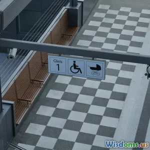
Mistake #3: Inaccessible Navigation and Wayfinding
The Maze, Not the Map
One of the most reported barriers in public buildings is confusing or inadequate navigation aids. Signage that's too small, placed too high, lacks contrast, or is text-only excludes large groups of users.
Real-World Insight:
- During revamps of New York’s Metropolitan Museum of Art, the absence of clear, accessible wayfinding was a primary user complaint. Even as new features were installed, poor map clarity and sign placement frustrated many—especially the elderly, people with limited English, and those with cognitive disabilities.
How to Get It Right
- Use large, sans-serif fonts on all signs.
- Position signs at wheelchair height as well as standing height.
- Use symbols alongside written instructions to bridge language gaps and aid neurodiverse users.
- Map circulation routes with clear, color-contrasted lines.
Quote:
“A sign is only useful if everyone who needs it can see, read, and understand it.” — Annalu Waller, Professor of Human Communication Technologies
Mistake #4: Ignoring Invisible Disabilities
Not All Needs Are Visible
Inclusive design falls short when it overlooks conditions like autism, chronic pain, or mental health challenges, whose requirements are less visible but equally vital.
Scenarios That Illustrate the Point:
- A building with dazzling overhead lights and throbbing acoustic echoes may inadvertently create a distressing environment for someone with sensory processing issues.
- Emergency alarms that are only audible—forgetting the profoundly Deaf or hard-of-hearing.
Data:
- According to the U.S. Centers for Disease Control and Prevention, 10% of Americans experience some form of invisible disability.
Bringing Inclusion to Every Layer
- Use soft, adjustable lighting, and minimize echoing materials where feasible.
- Install visual indicators for emergency systems.
- Design programs that allow staff training in “hidden” disabilities and support non-visible needs.
Mistake #5: Neglecting Amenities and Everyday Comforts
Infrastructure Beyond the Minimum
Meeting the bare minimum legal standards is not the mark of an inclusive building. Bathrooms without grab bars, “accessible” toilets used as storage, or drinking fountains too high for wheelchair users are persistent problems.
Recent Example:
- An audit by Australia's Human Rights Commission found that only 52% of surveyed public restrooms met basic accessibility standards, with issues from broken fixtures to lack of parent-friendly features.
Targeted Improvements for Daily Use
- Ensure amenities (toilets, baby-changing areas, water fountains, ATMs) adhere strictly to accessibility guidelines and are regularly maintained.
- Place queues, ticket counters, and service desks at accessible heights, and train staff in inclusive service protocols.
Mistake #6: Failing to Update and Maintain Accessibility Features
Accessibility Isn’t ‘Set and Forget’
Features like automatic doors, lifts, and tactile paths are sometimes installed then overlooked. Non-functioning doors or elevators undo years of progress in a moment.
Case Study:
- Paris Metro: Despite decades' worth of investment in “accessible” improvements, frequent breakdowns in lifts and escalators leave many stations effectively inaccessible.
Best Practice: Proactive Responsiveness
- Implement regular, logged maintenance cycles for all accessibility equipment.
- Offer real-time status updates (apps, websites) for lifts/elevators, as pioneered by Tokyo’s Shinjuku Station.
- Create feedback mechanisms for reporting faulty features directly to facilities management.
Mistake #7: Overlooking Community Engagement and Feedback
Users Know Best
No one understands barriers and needs better than those who experience them on a daily basis. Failing to consult with a diverse group of users in the planning, implementation, or evaluation stages inevitably causes missed issues or unsuitable solutions.
Real-World Approach:
- Before the revamp of Seattle Central Library, extensive engagement with local disability advocates helped shape every level of design, resulting in one of the most widely praised accessible public spaces in the U.S.
How to Involve the Community Effectively
- Hold public forums, workshops, and targeted outreach sessions (both in-person and online) to gather broad feedback.
- Test prototypes and pathways with users representing a wide range of needs.
- Make consultations ongoing, not one-off exercises.
Conclusion: Design (Inclusion) Is in the Details
Inclusive design isn’t just about checking boxes. It’s the difference between a building that says “welcome” to all and one that turns users away—sometimes literally. The mistakes detailed here don’t happen due to malice but rather through lack of foresight, narrow thinking, or insufficient consultation.
When we prioritize universal design from the beginning, recognize the spectrum of needs (including those less visible), plan for wayfinding and amenities as core elements, rigorously maintain infrastructure, and—above all—collaborate openly with community members, public buildings transform. They become true anchors of society: places where everyone, regardless of ability, finds dignity, independence, and opportunity.
It’s time for architects, developers, policymakers, and citizens to move beyond minimum standards and reimagine public buildings as stages for equitable, vibrant life. Avoiding these mistakes is the first step in that journey.
Extra Resources
- Center for Universal Design – NC State University
- The UK’s Accessibility Guide by Scope
- Web Content Accessibility Guidelines (for digital wayfinding and resources)
Take action: Examine your own public spaces, join conversations, or advocate for better planning. Let’s shift inclusive design from a hopeful idea to a daily norm—one space at a time.
Rate the Post
User Reviews
Other posts in Building Design


Popular Posts


