
Infographics Versus Dashboards Which One Tells the Story
9 min read Explore how infographics and dashboards differ in storytelling, data visualization, and decision-making to choose the right tool for your message. (0 Reviews)
Infographics Versus Dashboards: Which One Tells the Story?
In today's data-driven world, the ability to communicate complex information in a clear, engaging way is more essential than ever. Whether you're working in marketing, business analytics, education, or journalism, how you present your data can either captivate your audience or leave them confused and disengaged. Two of the most popular tools professionals use to visualize data are infographics and dashboards. But which one truly tells the story?
This article delves deep into the core differences, functions, and storytelling potential of infographics and dashboards. We explore their unique designs, goals, and the types of narratives each can support with compelling examples and expert insights. By the end, you'll have a clear understanding of when—and why—to use each tool to maximize your message’s impact.
Understanding the Basics: What Are Infographics and Dashboards?
Before comparing their storytelling capacities, let’s clarify what infographics and dashboards are.
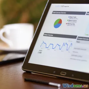
Infographics: Visual Narratives Designed to Inform and Engage
Infographics are visual representations of data and information designed to simplify complex topics into digestible, engaging formats. They combine text, images, charts, and icons to tell a story in a linear or thematic way.
For example, a public health infographic might illustrate the spread of flu during a season by merging statistics with visuals of affected regions, causes, and prevention tips. National Geographic famously uses infographics to explain environmental issues, such as one map showing deforestation trends alongside calls to action.
Infographics are often static but can be interactive, enhancing engagement. They’re ideal for persuading, educating, or summarizing research for a broad audience.
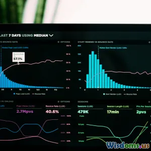
Dashboards: Real-Time Data Displays for Monitoring and Decision-Making
Dashboards are tools primarily created for monitoring and analyzing key metrics. They provide multiple visualizations—charts, tables, gauges—on a single screen, often updating in real time.
A marketing team may use a dashboard to track campaign performance, revealing data streams like website traffic, conversion rates, and social media engagement live. Business intelligence (BI) solutions such as Tableau and Power BI popularize dashboards for operational awareness and rapid insights.
Dashboards empower users to drill down into data dynamically, supporting decision-making rather than outright storytelling.
Comparing Purposes: Narrative vs. Monitoring
The fundamental difference lies in the main purpose each serves.
Infographics as Storytellers
Infographics aim to tell a story or convey a clear message. They work on a narrative arc, guiding viewers through information logically and emotionally. The design choices—color, flow, fonts—support this storytelling.
A study by the Nielsen Norman Group shows users tend to skim dashboards for quick data points, whereas infographics foster longer engagement due to their storytelling nature.
Dashboards as Analytical Tools
Dashboards focus on monitoring and exploration. Their goal is to provide a real-time, comprehensive view allowing quick responses to changing data. They are interactive and functional rather than narrative-driven.
An example includes a hospital’s patient monitoring dashboard displaying vital signs and alerts, enabling medical staff to act quickly.
Design and Structure: Visual Expression Differences
Layout and Composition
- Infographics usually have a fixed, scrollable, or printable layout arranged story-wise. The flow can be chronological, cause-and-effect, or thematic, placing visuals in a sequence.
- Dashboards utilize grid-based layouts where users can view all metrics simultaneously or customize views. Components like filters and dropdowns add interactivity.
Data Density and Complexity
- Infographics tend to emphasize clarity over complexity, avoiding overwhelming viewers. They distill information into salient points.
- Dashboards handle dense and multifaceted data, presenting large datasets with drill-down capabilities.
Visual Elements
- Infographics employ creative visuals—illustrations, icons, and stylized charts—to support the narrative.
- Dashboards stick with more straightforward, standardized visuals like bar charts, line graphs, and gauges for rapid comprehension.
Storytelling Effectiveness: Who Captivates the Audience Better?
Emotional Engagement
Infographics can invoke emotions by telling a story through visualization, making abstract data tangible and relatable.
For instance, during the COVID-19 pandemic, infographics visualizing infection spread patterns alongside preventive measures helped change public behavior effectively.
Analytical Insight
Dashboards empower users to formulate and test their own narratives via data exploration. For example, a sales director can identify underperforming regions dynamically through filters.
Longevity and Shareability
Infographics are highly shareable and suitable for campaigns, reports, and educational content because they provide a self-contained story.
Dashboards excel in ongoing operational contexts rather than one-off communication.
Real-World Applications: When to Use Each
Infographics
- Marketing Campaign Summaries: Showcasing campaign results succinctly for stakeholders.
- Educational Content: Simplifying complex data for students or public awareness.
- Annual Reports: Highlighting achievements with visual impact.
Dashboards
- Business Performance Monitoring: Real-time sales figures and KPIs.
- Healthcare Management: Tracking patient status and resource needs.
- Financial Markets: Observing stock performance and indicators live.
Expert Insights
Data visualization thought-leader Alberto Cairo emphasizes, "Infographics are good at fostering understanding and retention because they narrate data. Dashboards excel in situational awareness and operational efficiency." Their roles are complementary rather than mutually exclusive.
Nate Yau, founder of FlowingData, highlights that effective storytelling in data visualization requires clear context, audience understanding, and intention—qualities well suited to infographics.
Integrating Both for Maximum Impact
Merging storytelling with monitoring can offer strategic advantages. For instance, companies may generate infographics summarizing insights derived from data monitored through dashboards, enriching communication with context and narrative.
Tools like Microsoft Power BI and Tableau now support embedding infographic-style stories alongside dashboards, enabling users to switch between exploration and storytelling seamlessly.
Conclusion: Which One Tells the Story?
In essence, infographics are the storytellers—they craft and share a coherent data narrative with emotional and educational appeal. They excel at informing and persuading wider audiences with clarity and creativity.
Dashboards are the analysts' command center, designed for real-time monitoring, exploration, and action. Their strength lies in providing up-to-date insights for decision-making rather than telling one fixed story.
Choosing the right tool depends on your goal:
- Want to engage and educate? Go for infographics.
- Need to track and react to live data? Choose dashboards.
Understanding these distinctions helps communicators select and design visual tools that truly convey their messages and empower their audiences effectively.
Ultimately, the story depends on the storyteller—and having both infographics and dashboards in your toolkit ensures you can tell the right story at the right time.
Rate the Post
User Reviews


Popular Posts


